General
General Property: This video contains how to use general property of trendline for chart in OPNBI.
tip
Only users with Dashboard privilege have access to this section!
Read 5 minutes tutorial here.
- A Trendline is a line drawn over chart’s highs or under chart’s lows to show the prevailing direction of price. Trendlines are a visual representation of support and resistance in any time frame. They show direction and speed of price, and also describe patterns during periods of data contraction.
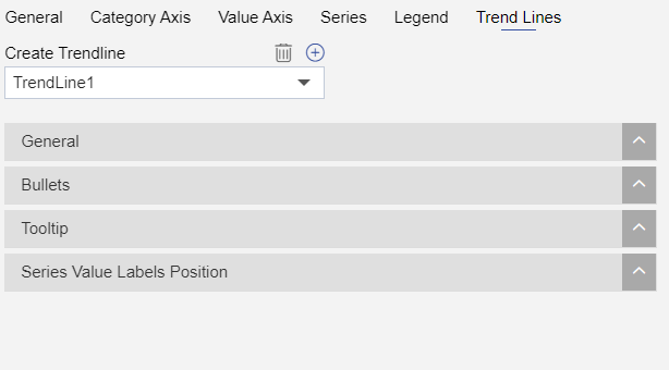
Once the user clicks on the Plus icon (+), a new Trend Line gets added in the charts and the four control menu appear as shown in figure below:

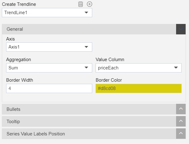
General controls the TrendLine appearance related functions:

Axis: In this option, user can select the available axis in widget.
Aggregation: This type of display is useful if you want to present summarized results in charts.
- Following types of aggregation are available:
Count.
Sum.
Avg.
Distinct Count.
Cumulative Count.
Cumulative Sum.
Absolute Sum.
Max.
Min.
First.
Last.
Value Column: Used to select the value column for Trend Line.
Border Width: to make changes to the width of the border of the trend line.
Border Color: to make changes to the color of the border of the trend line.
To know more about other Trend Line property click on below links:-