Border Properties
Widget Border Properties
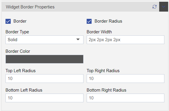
- The Widget Border properties used to add border in the widget, Here in OPNBI we have two kind of functionalities under the border properties.
- By clicking on border checkbox, you will enable the border functions of the widget.
- The border type, border width and border colour.
The border types are dotted, dashed, solid, double, groove, ridge, inset, outset, none, hidden. In border Width you can set width in top, bottom, left, and right side of the widget. The box border colour is use to set colours of border, you can also set the opacity of the selected colour in it, and user can also enter colour code to fetch colour for border.
- Box Radius is use to (round widget corners) set user’s entered radius in widget border. these four options are used to set radius (Top left and right, Bottom left and right).
