Tab to Tab Filters
Introduction
This document explains how to apply filters across the tabs and what are the ways a user can perform tab to tab filtering. In a single dashboard, you can create multiple visualization solutions by using tabs & Layers. It is possible to create multiple visualizations for a single solution in a single dashboard or you can also show Multiple visualizations of different domains in a single dashboard using the tabs and layers feature provided in the Application.
Objective
The objective of this document is to guide users to perform tab to tab filtering in the dashboard in multiple ways.
Prerequisites
Users will be required to the following dataset to understand tab to tab filter scenarios;
sales.cds dataset
Parameter sales.ds dataset
Download above dataset by clicking here extract this file and upload the dataset in the dataset section using drag and drop.
Use case
Generally, the best practice is to show multiple visualizations for a whole solution in a single dashboard. there might be scenarios where the information we want to display in a dashboard is very high and we can not accommodate all the visualization widgets in a single window. in such cases, we should group several visualizations into several categories and create visualizations in different tabs for each category. By doing this we are making sure all the required information is presented in a single dashboard and the users can relate each category's data with the other category by switching tabs.
You will find dashboard open in embed mode in below image,
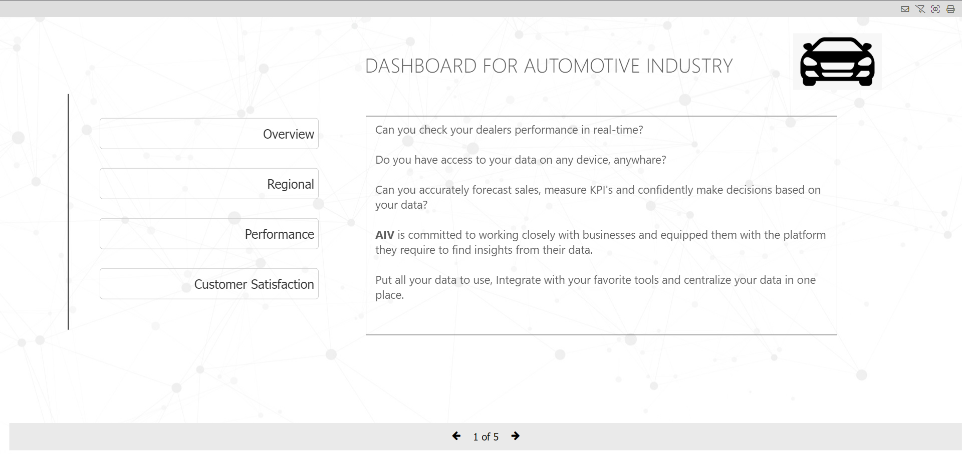
Here a complete automobile solution has been added to a single dashboard in multiple tabs. here whole automobile solution is divided into 4 tabs;
1. Overview
2. Regional
3. Performance
4. Customer Satisfaction
Here users can navigate to each tab by using the navigation icons provided at the bottom or clicking on the 4 options provided on the home page as a button.
When using multiple tabs in a dashboard it is often required that the user need to filter the whole dashboard by some category or group of categories from one place. filter applied from one tab should be applied with relevant widgets in all other tabs as well.
There are multiple ways to achieve this requirement,
1. By using the auto link
This option will only work if you are using the same dataset across all the tabs.
warning
If you have a parameterized dataset and you want to pass filter values into the parameter, please check point number 4.
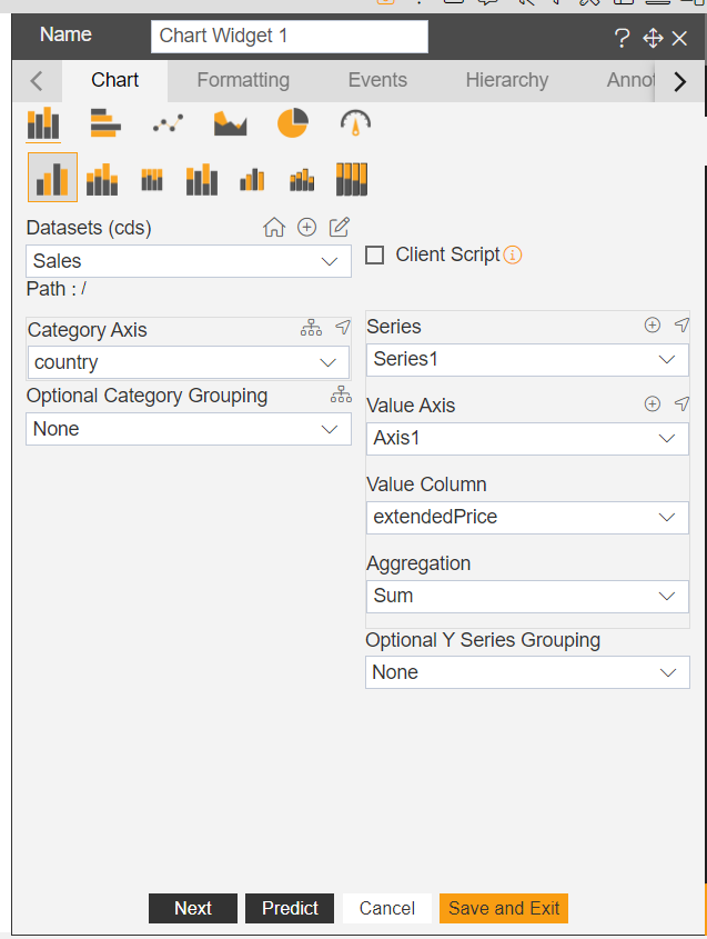
Create a new dashboard and add a new chart widget using sales.cds dataset.
Set below properties in Category, Value axis and Aggregation;
Category Axis: country

Value Column: extendedPrice

Aggregation: sum
Click on save and exit to save the changes.
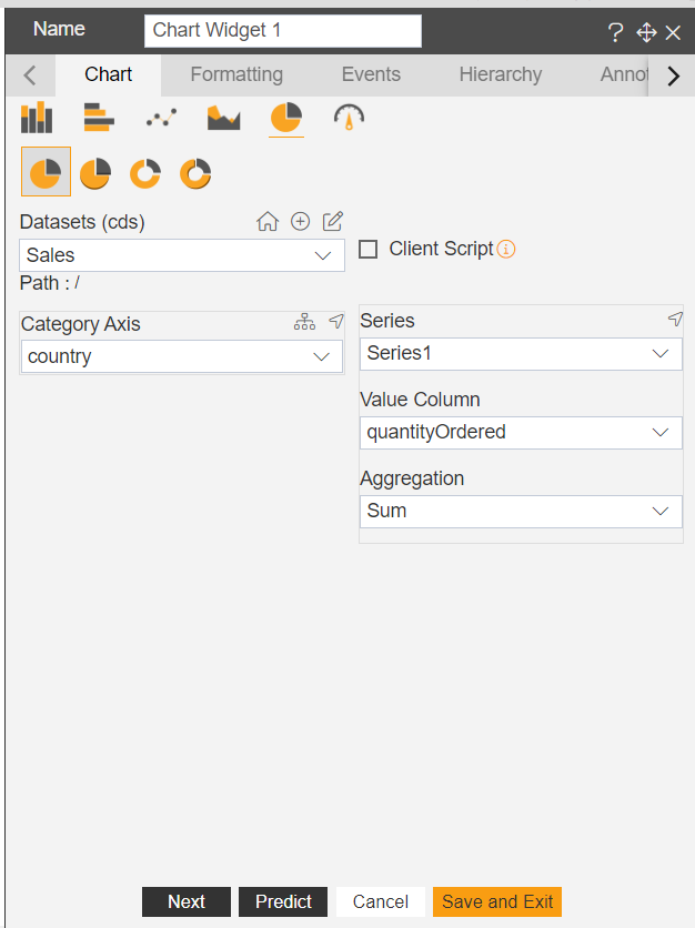
4.Create a new tab and add a new chart widget, a Pie chart this time with same sales.cds dataset.
- Click on preview to go to dashboard preview mode.
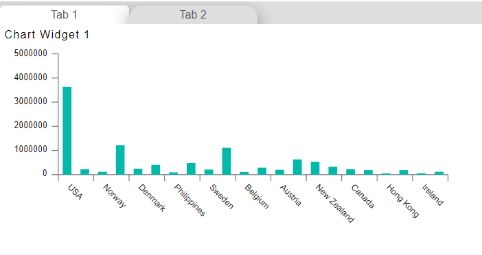
- Click on USA country from the chart created in tab-1 and go to tab 2 and check pie chart value.
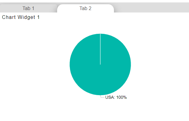
You may observed the chart in tab 2 is also filtred by the value click in chart of tab 1.
To clear this filter, click on the clear filter icon given in the dashboard options in the top right corner.
Try to apply the filter from tab 2, click on any slice of a pie chart, and check in tab 1, the column chart got filtered now.
That is how autolink is working. if you have used the same dataset in all the tabs to create a widget, all the widgets are automatically linked with each other. this auto link feature is enabled by default for each widget in the application.
warning
if you do not want this type of behavior, you can disable it on the widget level. you will find this property in widget setting options.
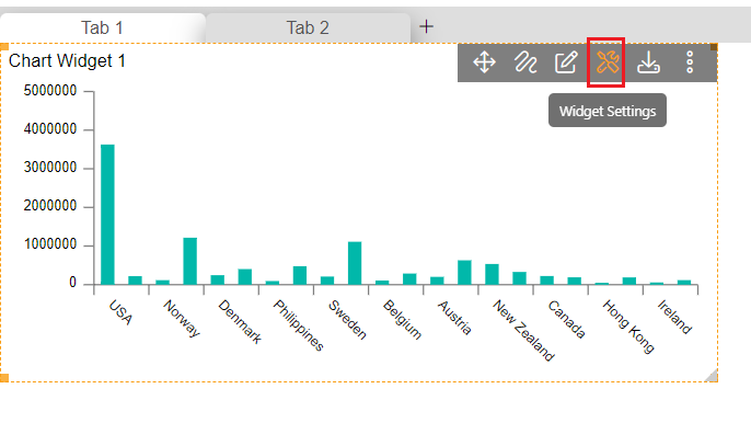
- To disable the auto link, hover on any widget and you will see a setting icon, click on that icon, and the setting window will open.
Expand Dynamic Auto link option and deselect Auto link option and click on save and exit to save the changes.
Go to dashboard preview mode and again click on column chart values and check this time chart in tab 2 is filtered. clear this filter and go to tab 2 and click on any slices of a pie chart and go to tab 1.
- But this time, the column chart is not filtered as we have disabled the Auto link option from the settings option.
- Same way if you do not want your widget to get filtered by auto link, go to settings and disable it.
2. Dynamic widget link
This feature will be useful when you have different datasets across the dashboard and still you want to filter each widget from any one widget in the dashboard.
warning
Here Make sure the widgets you want to filter should have some data in common to apply the filter.
Let's consider the above dashboard example, disable the auto-link in both the widget and save the changes
Go to tab-1 and hover on the column chart and you will see a vertical ellipses icon. you will see a context menu open as shown in below figure,
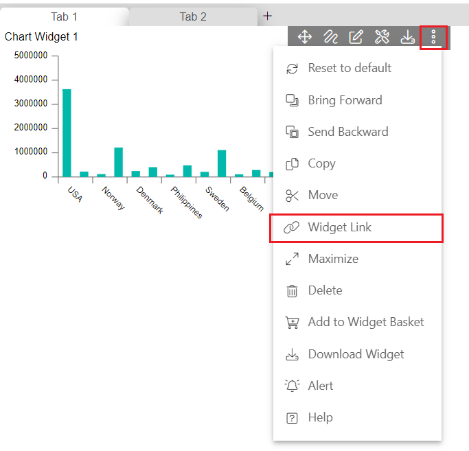
- You will see the Widget Link option and click on it. you will see a Widget Link option.
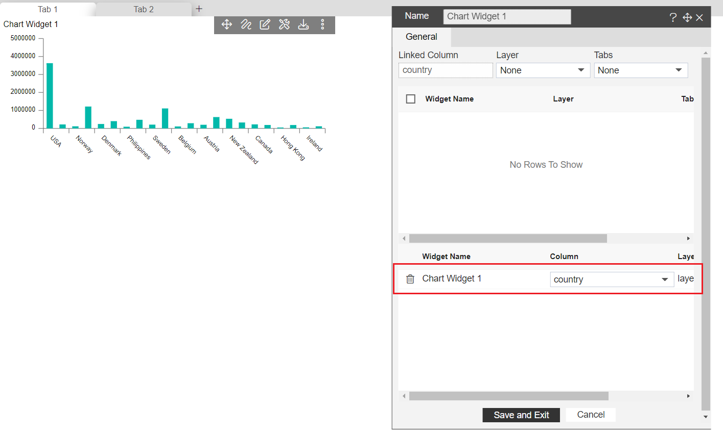
Select layer1 and tab 2 from the dropdown and you will see widgets available to link from tab 2. in some cases, by default you will see all widgets from tab 2 are already in the selected pane of the window (in the bottom side). if you do not see it, select Layer from the layer list from the top menu and select tab 2.
You will see chart widget1 is in the list. select the chart widget to link by marking the checkbox just left to widget name.
Once the widget is selected and reflected at the bottom of the window, click on the dropdown menu to see the list of the available columns that the widget has.
From the list of the column you need to select a column that has matching data with the column chart. you can see on the top column we are going to link is country from the column widget so here we have country data in the pie chart in country column. so select a country from the list and click on save and exit to save the changes.
you will see a message Link is Created in the prompt when you click on save and exit.
So here we have created a link between the country column of Chart Widget 1 and the country column of the pie chart.
info
This link is to filter the pie charts on click of column chart values.
Once you click on the column chart value, go to tab-2 and you will see the pie chart is filtred with the value click on the column chart.
This option is generally used when you are using different datasets across the dashboard or you want to apply a filter on very specific widgets and exclude all other widgets.
3. Extending Filter scope
This feature will be useful when it is required to filter widgets across the tab with a dedicated filter. With this option, the user can pass a filter value in the parameter if there is a parameter dataset used. Let's explore how this feature will work. Here we will use a parameter dataset in both widgets.
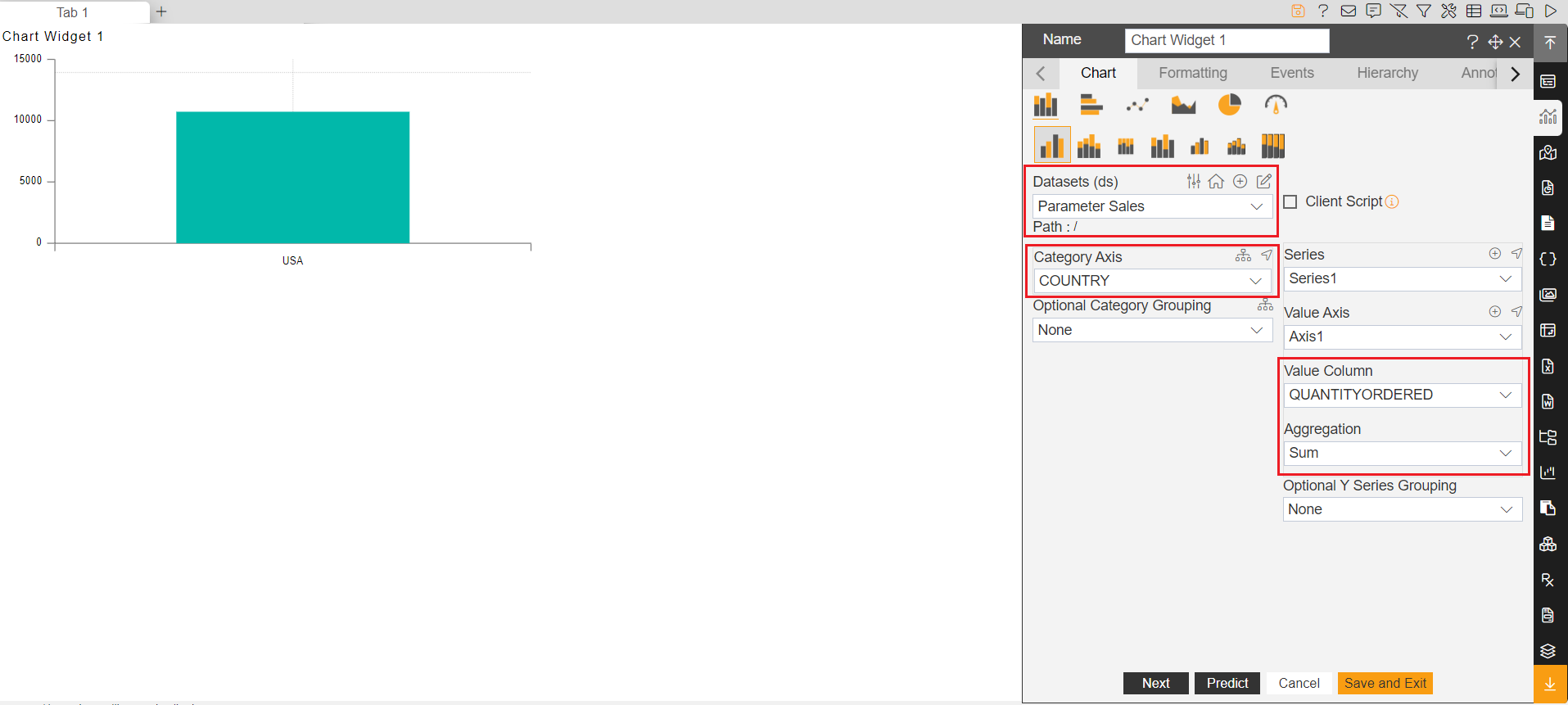
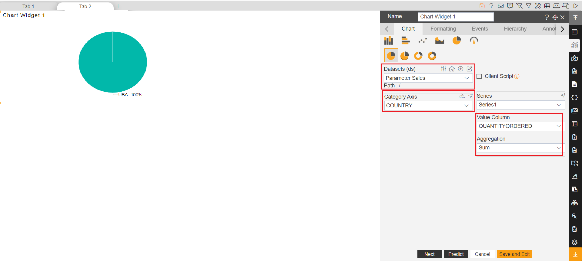
Create a new dashboard and add a chart widget. Select the following information in the chart widget. Click on the save and exit button to save the changes.
Dataset: Parameter Sales.ds
Category Axis: COUNTRY
Value Column: QUANTITYORDERED
Aggregation: Sum
Create Tab-2 in the dashboard and create a new pie chart in it. add the following properties to create a pie chart. Click on the save and exit button to save the changes.
Dataset: Parameter Sales.ds
Category Axis: COUNTRY
Value Column: QUANTITYORDERED
Aggregation: Sum
This dataset we have used in both widgets has 3 parameters named line for productline, country for the country, and cno for the customer number.
The requirement is to filter both the widget values with country and the whole data should be filtered according to the country filter value selected. and that is why the value selected from the filter dropdown should be passed into the country parameter to get the required data dynamically.
Create a filter named country from the dashboard icons on the top right corner.
info
To know more about filter creation, please Follow this link.
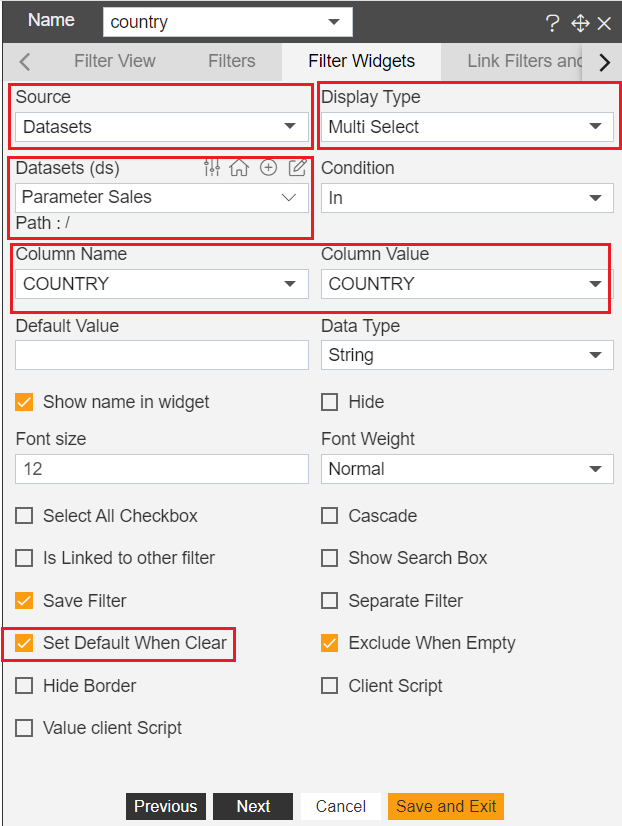
In the Filter Widget tab, select the following properties,
Source: Dataset
Display Type: Multi Select
Datasets: Parameter Sales
Condition: In
Column Name: COUNTRY
Column Value: COUNTRY
Set Default When Clear: Checked
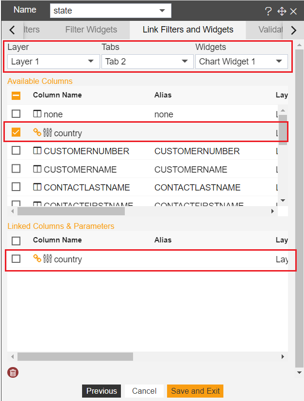
Now we will link all widgets required from the Link Filters and widgets tab. here we will define the scope of the filter widget. we can link this filter with a widget available in any tab or layer. so click on the Link Filters and widgets tab next to the Filter Widgets tab.
First thing you will see is 3 dropdowns named Layer, Tabs, and Widgets. user can select where the widget is located i.e. in which layer and in which tab. first, you need to select the layer and then select a tab where your widget is located.
::: warning By default layers are disabled. The default layer is Layer 1 in every dashboard. if you want to make the layer visible kindly click on the dashboard setting icon on the top right corner and there you will see Hide Layer and Tabs. from here you can control the visibility of layers and tabs. :::
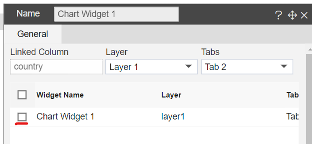
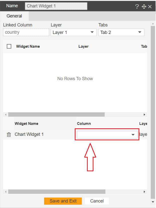
Once you select Layer, next you will see a list of tabs available in that layer. here we have created 2 tabs so you will see Tab 1 and Tab 2. let us link the filter with the chart widget available in Tab 1. Select Tab 1 from the list of the tabs. next, you will see the list of widgets available in the selected tab.
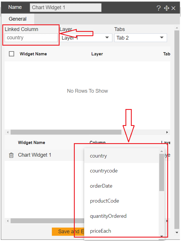
Select Chart Widget from the list and you will see a list of columns available in the dataset used to create the Chart widget. you can see parameters in this list of columns having a setting icon.
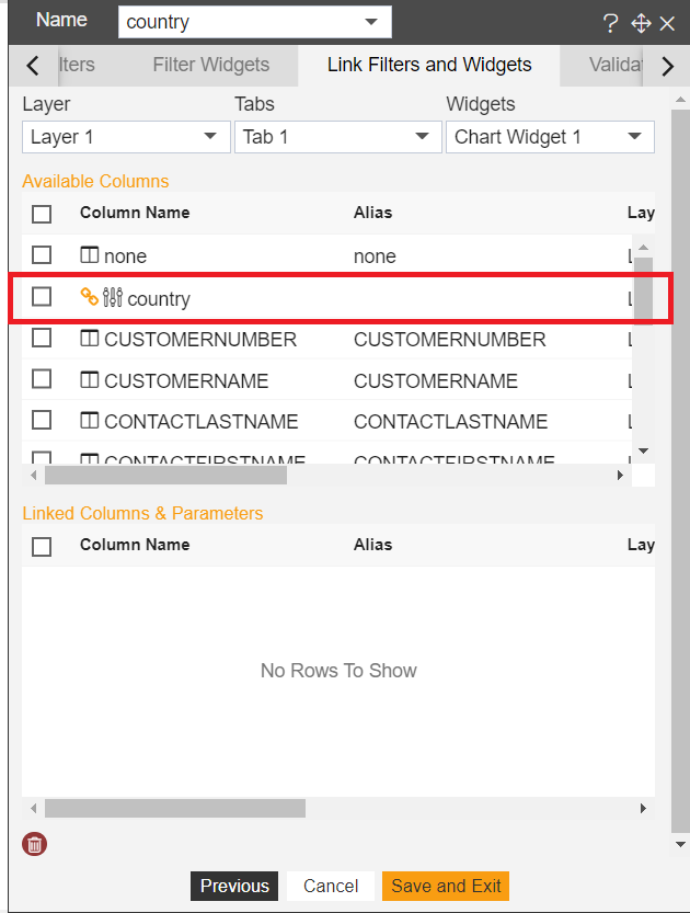
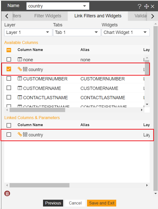
Here as our requirement to pass country filter value in country parameter of chart widget, select country parameter by clicking on it. once you click on the country parameter, you will see this parameter is available in the Linked Columns & Parameters field. that means this country filter is now linked with the country parameter of the chart widget of tab 1.
Same way we need to link this filter with the pie chart available in Tab 2. to do so, from the Layer list select None and select Layer 1 from the layers list. select Tab 2 from the list of the tabs. select the pie chart widget from the widgets list of Tab 2. Select the country parameter from the list of columns of the pie chart to map it with the country filter.

Click on the save and exit button to save the changes.
Now both the widgets from different tabs have been linked with filter country.
Add this filter to the dashboard. again click on the filter icon available in the dashboard settings icons in the top right corner.
This time you will see a country filter created. to add this filter to the dashboard, click on the Filter View tab available on the left side of the Filters tab and click on the small + icon. once you click on this icon, the filter will be added to the currently active tab of the dashboard. I am adding this in Tab 1.
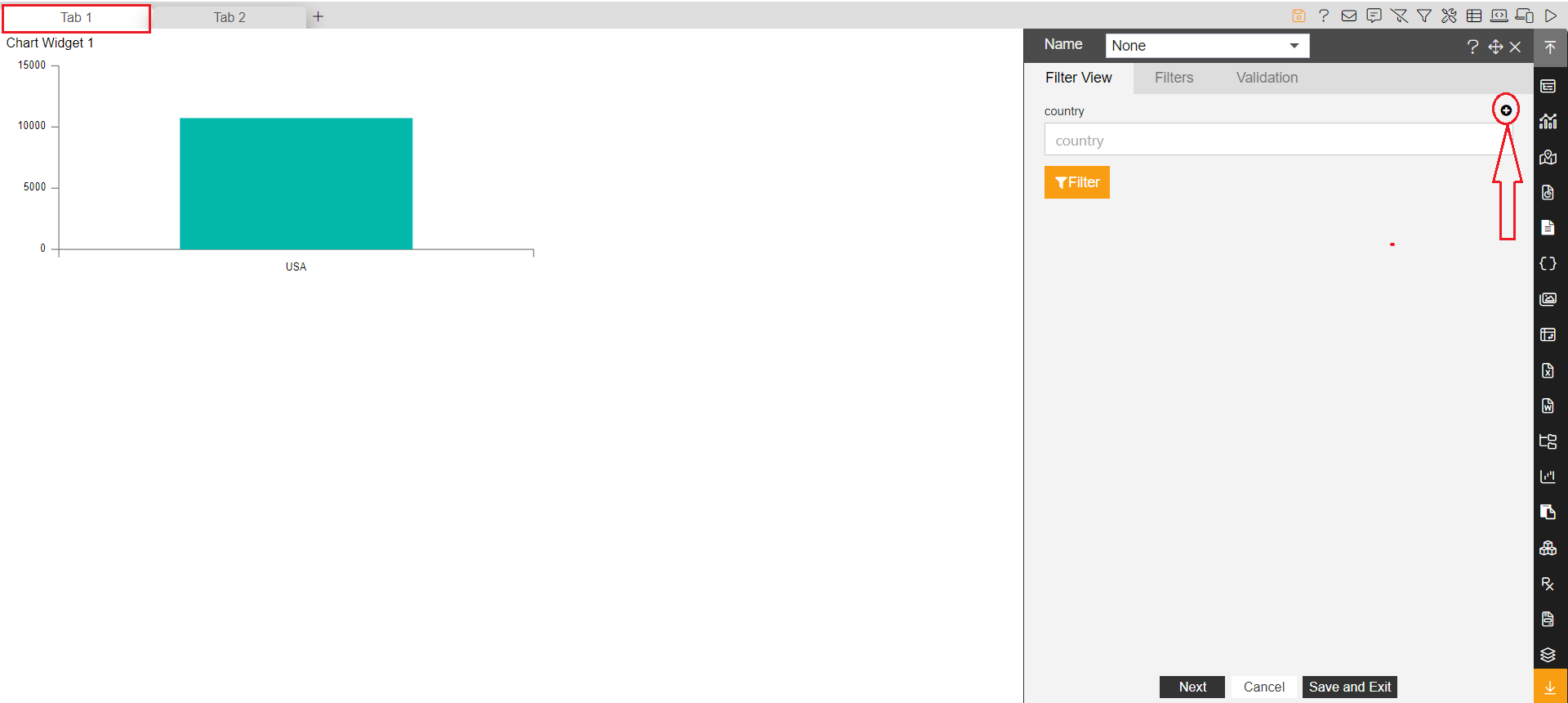
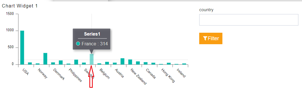
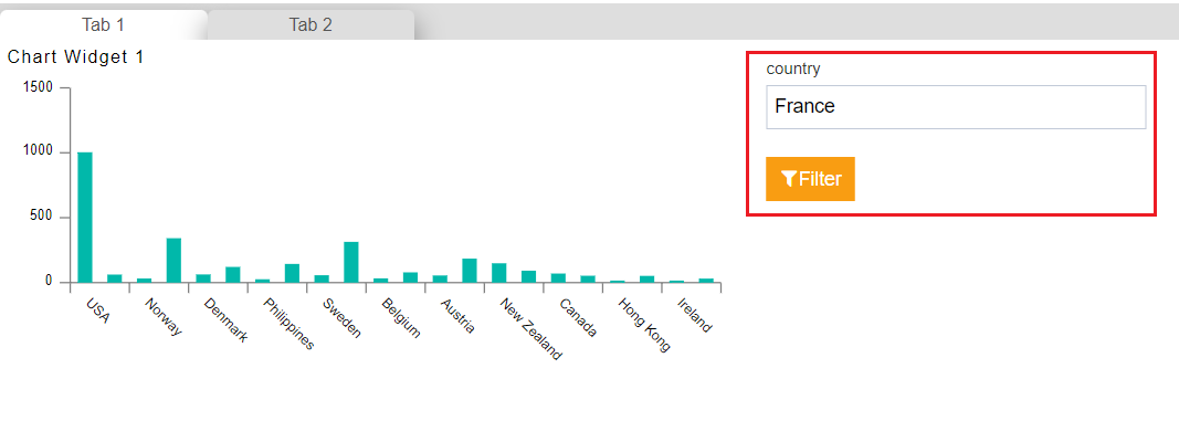
Country filter has been added in dashboard tab 1. to see the filter working, go to dashboard preview mode by clicking on a preview button.
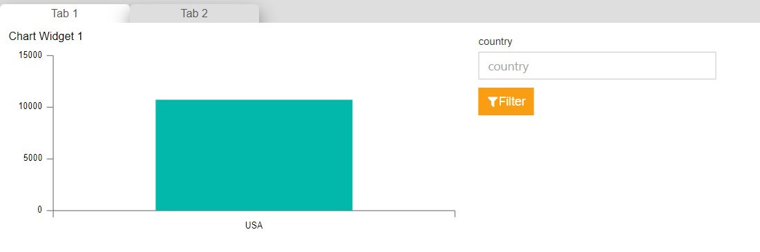
Click on the filter and the multi-select dropdown will be opened. select any values of the country and click on the filter button.
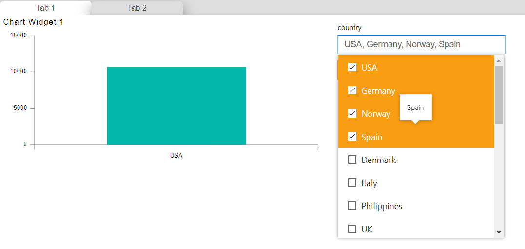
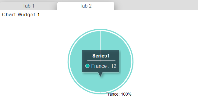
chart of the tab-1 will get filtered and also check in tab-2, a pie chart is also filtered with values selected in the filter.
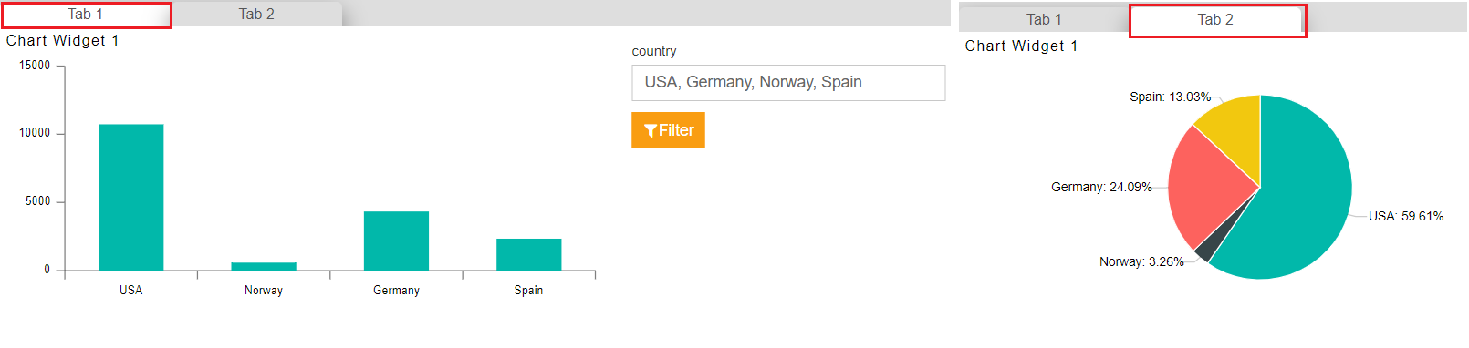
This is how a user can link one filter with multiple tabs of the dashboard and to clear the filter, click on the clear filter icon from the top right corner icons.
4. Using Events for filtering
In the Above use case, we have seen we can link widgets of any tab by extending the cope of the filter. Using filters we can also pass filter values in dataset parameters which is not the case in the first 2 scenarios. But we have seen that in the first 2 scenarios we can filter the widgets by clicking on widget values. This flexibility is not available when using filter widgets.
In case you want to filter the widgets on the click of widget values clicked values should pass in dataset parameters in that case we can use events.
Let's understand this by one example, we will create a new dashboard where we will create 2 widgets in 2 different tabs. By clicking on the values of the first widget, the widget of tab 2 will get filtered and the value should be passed in the parameter of the dataset.
Follow the below steps to get hands-on with this use case scenario;
Create a new dashboard and add a column chart widget to the dashboard. apply the following properties in the chart widget,
Datasets: Sales.cds
Category Axis: country
Value Column: quantityOrdered
Aggregation: Count
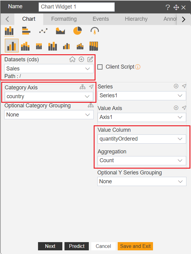
Click on save and exit to save the changes
Create a new tab named Tab 2 and add a pie chart in tab 2. apply the following properties in the chart widget,
Datasets: Parameter Sales
Category Axis: STATE
Value Column: CUSTOMERNUMBER
Aggregation: Count
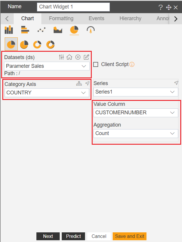
Click on save and exit to save the changes
Here for both the widgets, the dataset is the same so auto-link will be applied directly. let's first remove the autolinkfirst. hover on the widget of tab 1 and click on the widget setting icon. find an option called Dynamic Auto Link and disable it. click on save and exit to save the changes.
Do the same for the second widget of Tab 2 and disable the auto link.
Go to tab 1 again and edit the column chart widget
In widget edit properties go to the event tab. in the event tab write the below code;
    var tab = new CustomEvent("opnbi-change-tab", {    "detail": 1 });
    window.parent.dispatchEvent(tab);
    var item = event.event.point.x; setTimeout(function(){
    var filter = new CustomEvent("opnbi-filter-call", {
    "detail": {"filterName": item}  });  window.parent.dispatchEvent(filter); });
Click on preview and save and exit to save the script.
Now we have applied an event that fetches the clicked value from the column chart and takes the user to Tab 2.
Go to preview mode and check redirection from tab 1 to tab 2 is working or not by clicking on any country values. for example, go to preview mode and click on the city named France from the column chart and it will take you to tab 2.
Till now we haven't linked clicked value with the dataset parameter of the pie chart widget. to do this first we need to create a dummy filter that acts as an intermediate link to pass clicked values to the specified widget.
This dummy filter has to be created as we can not directly pass any clicked values into the widget parameter. go to the edit dashboard and create a country filter. set the following properties into this filter;
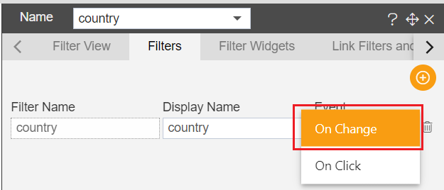
Click on the setting icon to configure this filter,
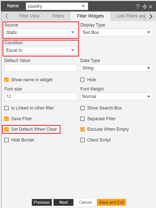
Go to Link Filters and Widgets tab to link filter with tab 2 pie chart. select the following properties to link the filter with the country parameter.
Click on save and exit to save the changes.
Add this filter to tab 1 of the dashboard, click on the filter icon from the dashboard icons and go to the Filter View tab
Click on the + icon to add a filter to the dashboard. click on save and exit to save the changes.
Now this filter works as a mediator between script and pie chart. this filter will pass the script value to the pie chart parameter and the pie chart will filter accordingly.
There is one thing remaining now, we have written script and link filter with pie chart but we have to give knowledge of filter we have created to script.
To do so, edit the column chart, go to the event tab, and find attribute filterName. instead of this filtername you have to pass the name of the filter we have created. in this case name of the filter is country so instead of filtername write country in the script.
warning
The name of the filter is case sensitive, the script might fail if a user made mistake in writing the filter name.
- the script is not would be;
    var tab = new CustomEvent("opnbi-change-tab", {    "detail": 1 });
    window.parent.dispatchEvent(tab);
    var item = event.event.point.x; setTimeout(function(){
    var filter = new CustomEvent("opnbi-filter-call", {
    "detail": {"country": item}  });  window.parent.dispatchEvent(filter); });
Click on preview and save and exit to save the changes.
Go to dashboard preview mode and click on any country name of the column chart. click on country France
as soon as you click on any country value, the script will take you to tab 2 and this time pie chart will get filtered.
The below diagram explains the working of the event filter.

Event passes the clicked value into filter and filter pass value into widget parameters. so once you come back to tab 1 you will see clicked value is available in the filter.
In case you do not want to show this filter to users in the dashboard you can hide this filter by moving backward of the chart widget. this way filter will not be visible to end-users and what they see is on click filtering of widgets.
To do this go to dashboard edit mode and hover on the filter widget. you will see vertical ellipses, click on it and you will see an option named Send Backward. Click on this option and drag this widget over the chart widget and drop it.
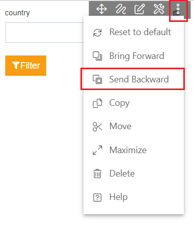
You can see this filter is now under the chart widget and can not be visible by the end-user. you can still perform the on-click filter operations.
info
You can link as many widgets from different tabs using 4 use cases provided in this document. please refer similar document that might help you;