Creditcard details solution
The following document contains Creditcard details solution:
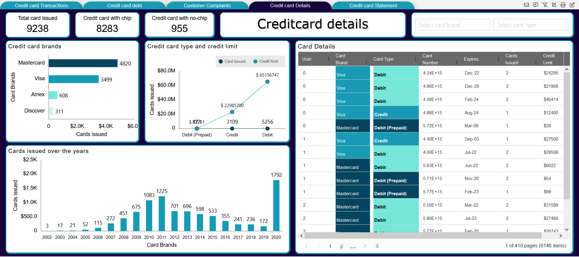
The credit card solution contains the visualization and reports over the Credit card transaction, Customer details, Customer complaints over the credit card, card details, credit card statement report.
Following screen of the dashboard as follows:
- Creditcard details:
Data sources and datasets:
Here, we have used the CSV format data files to import data in OpnBI application. after adding the CSV files, we have added the respective datasets as follows:
- User should have these files before we start making of dashboards: -
| Datasources | Datasets |
|---|---|
| Card_details.csv | Creditcard_details.ds |
| Creditcard_complaints.csv | Creditcard_complaints.ds |
| Customer_details.csv | Customer_details.ds |
| User_credit_card_transactions.csv | Creditcard_transactions.ds |
| Creditcard statement.xlsx | - |
info
To make the creditcard details solution. we need the resource as Card_details.CSV and Dataset as Creditcard_details.ds
List of components used in Creditcard Details:
| Sr.no. | Widget type | Widget names |
|---|---|---|
| 1 | Card widget(KPI) | Total card issued |
| 2 | Card widget(KPI) | Number of card has chip |
| 3 | Card widget(KPI) | Number of card has no-chip |
| 4 | Bar chart | Credit card brands |
| 5 | Line chart | Credit card type and credit limit |
| 6 | Table widget | Card Details |
| 7 | Column Chart | Cards issued over the years |
| 8 | creditcard details | Tab title |
| 9 | Filter | Select card brand |
| 10 | Filter | Select Card type |
Steps to create Creditcard details Solution:
- Login to OPNBI:

- Login using your credentials (UserID, Password), we are login as admin here.

- Now to add the dashboard in OpnBi, click on hamburger icon from top-left corner and get the menu bar, then click on (+) plus icon from Dashboard as shown in figure below:

- Add the name of the dashboard in Name textbox:
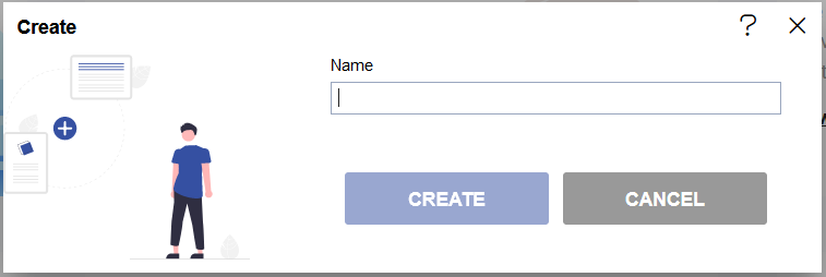
- After adding the name, click on the CREATE button from the create dashboard dialog box.
- When the dashboard gets added in the application it shows the redirect alert message.
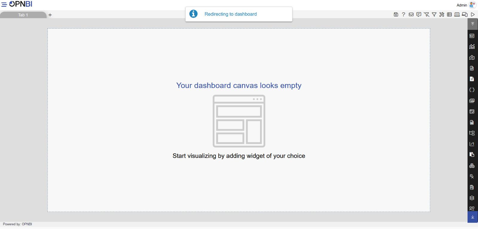
note
The dashboard is added in the application, in the dashboard from the right-vertical menu you can add different types of widgets in the dashboard and the top-right corner provide the features like Embed dashboard, adding filter, Send mails, Dynamic messages, Mobile view/Tab screen view, Preview dashboard etc.
- Follow below steps to create this dashboard:
1. Creditcard details title:

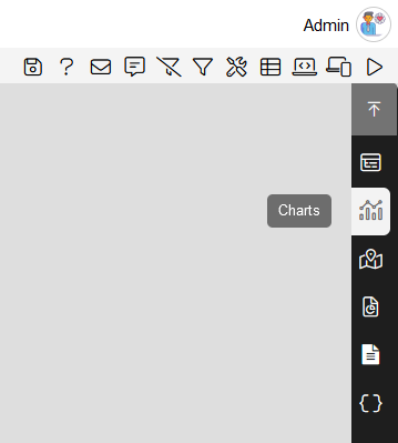
- Select the custom visualization from the right-vertical menu bar, as shown in the figure below:

- After adding the custom visualization in dashboard, go to the HTML tab from the top-menu bar from its edit properties, as shown in the figure below:
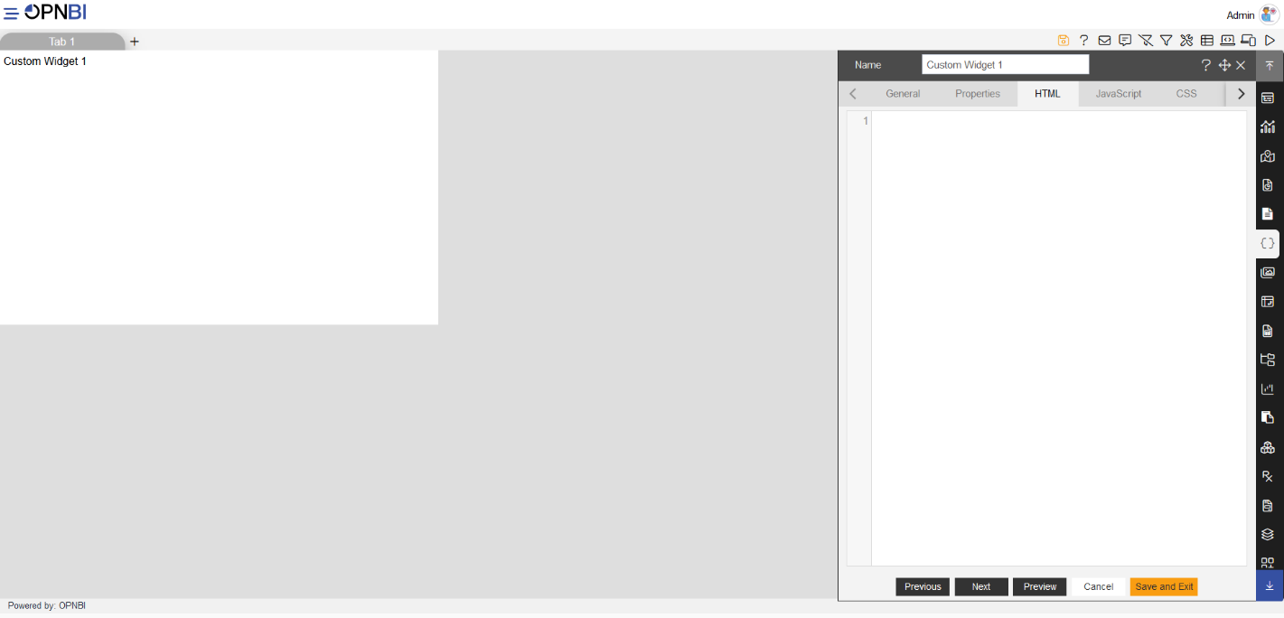
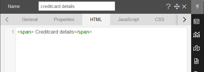
Add the widget title in Name: creditcard details.
Now, add the title as required in HTML tab:
<span> Creditcard details</span>
- Click on the preview button to see the preview in widget, as shown in the figure below:
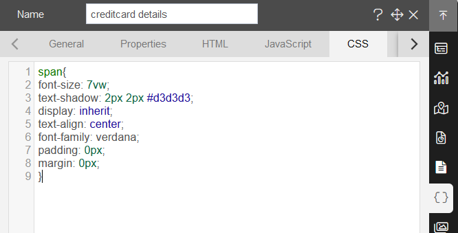
- Add the CSS style properties as shown in the figure below:
- CSS style code,, you can copy the code and apply in your dashboards:
span{
font-size: 7vw;
text-shadow: 2px 2px #d3d3d3;
display: inherit;
text-align: center;
font-family: verdana;
padding: 0px;
margin: 0px;
}
note
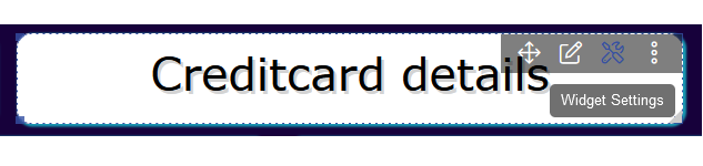
After applying the CSS style, the title text gets white in color, to that title property, apply the widget style settings.
- Now click on Preview button to see the preview.

info
In this document, After the details we have provided the image to compare that with your output screen.
Widget style settings:
- Click on the widget settings as shown in the figure below:
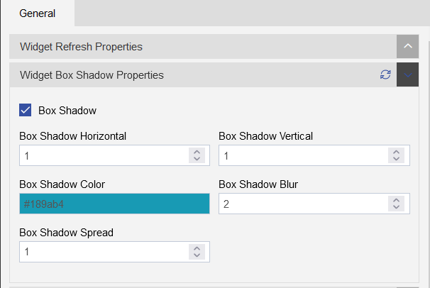
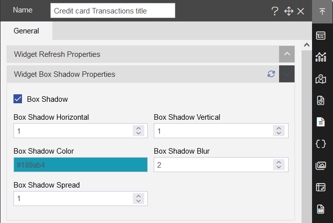
From the widget settings click on the widget box shadow properties:
Add the Widget Box Shadow Properties using the toggle button of Box Shadow, as shown in the figure below:
| Widget Box Shadow Properties | |
|---|---|
| Box Shadow checkbox | Click on the checkbox |
| Box Shadow Horizontal: | 1 |
| Box Shadow Vertical: | 1 |
| Box Shadow Color: | #189ab4 |
| Box Shadow Blur: | 2 |
| Box Shadow Spread: | 1 |
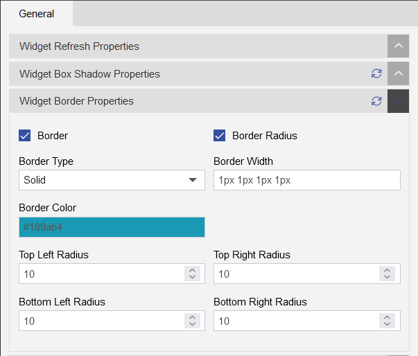
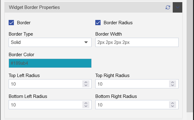
- Add Widget Border and Border Radius using the Widget Border Properties,select the Border and Border Radius toggle button as shown in the figure below:
| Widget Border Properties | |
|---|---|
| Border checkbox: | Click on border checkbox to enable the properties |
| Border Type: | Solid |
| Border Width: | 1px 1px 1px 1px |
| Border Color: | #189ab4 |
| Border Radius: | Click on border radius checkbox to enable the properties |
| Top Left Radius: | 10 |
| Top Right Radius: | 10 |
| Bottom Left Radius: | 10 |
| Bottom Right Radius: | 10 |
- Remove the Title form the widget using the Title Properties, click on the title properties.
- Click on the Show Title toggle button to uncheck the title, as shown in the figure below:

- Click on the Save and Exit button to save the component.
2. Total card issued (Card widget)

- Select the Card widget from the right-vertical menu bar, as shown in the figure below:
- follow the below steps to achieve this card widget:
| Enter widget name: | Total card issued |
|---|---|
| Datasets(ds) | Creditcard_details |
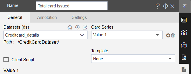
- After adding the card widget, add the below details in Value1, as shown in figure below:
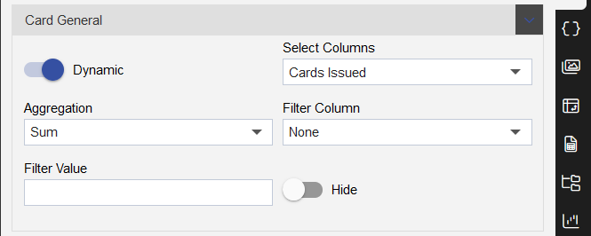
- Insert following details in card widget:
| Card General | |
|---|---|
| Select Columns | Cards Issued |
| Aggregation | Sum |
| Filter column | None |
| Filter Value | - |
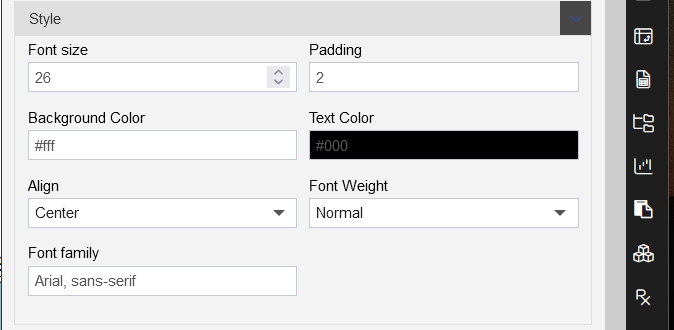
| Style | |
|---|---|
| Font Size: | 26 |
| Padding: | 2 |
| Background Color: | #ffffff |
| Text Color: | #000000 |
| Align: | Center |
| Font Weight: | Normal |
| Font Family: | Arial,sens-serif |

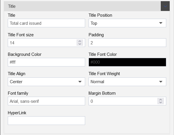
| Card Title | |
|---|---|
| Title: | Total card issued |
| Title Position: | Top |
| Title Font size: | 14 |
| Padding: | 2 |
| Background Color: | #ffffff |
| Title Font Color: | #000000 |
| Title Align: | Center |
| Title Font Weight: | Normal |
| Font family: | Arial,sans-serif |
| Mergin Bottom: | 0 |
| HyperLink | - |
- Add widget settings, click on the settings tab, as shown in the figure below:
Add Widget Box Shadow Properties as follows:
| Widget Box Shadow Properties | |
|---|---|
| Box Shadow checkbox | Click on the checkbox |
| Box Shadow Horizontal: | 1 |
| Box Shadow Vertical: | 1 |
| Box Shadow Color: | #189ab4 |
| Box Shadow Blur: | 2 |
| Box Shadow Spread: | 1 |
Add Widget Border Properties as follows:
| Widget Border Properties | |
|---|---|
| Border checkbox: | Click on border checkbox to enable the properties |
| Border Type: | Solid |
| Border Width: | 2px 2px 2px 2px |
| Border Color: | #189ab4 |
| Border Radius: | Click on border radius checkbox to enable the properties |
| Top Left Radius: | 10 |
| Top Right Radius: | 10 |
| Bottom Left Radius: | 10 |
| Bottom Right Radius: | 10 |
- Remove the Title form the widget using the Title Properties, click on the title properties, as shown in the figure below:

- Click on the Show Title toggle button to uncheck the title, as shown in the figure below:
- Click on the Save and Exit button to save the component.
3. Number of card has chip (Card widget)
- Select the Card widget from the right-vertical menu bar, as shown in the figure below:
- follow the below steps to achieve this card widget:
| Enter widget name: | Number of card has chip |
|---|---|
| Datasets(ds) | Creditcard_details |
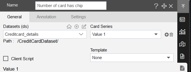
- After adding the card widget, add the below details in Value1, as shown in figure below:
- Insert following details in card widget:
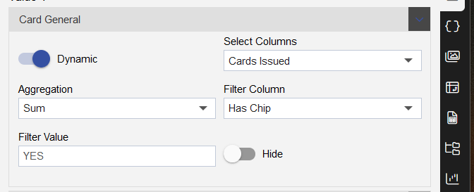
| Card General | |
|---|---|
| Select Columns | Card Issued |
| Aggregation | Sum |
| Filter column | HAs Chip |
| Filter Value | YES |
| Style | |
|---|---|
| Font Size: | 26 |
| Padding: | 2 |
| Background Color: | #ffffff |
| Text Color: | #000000 |
| Align: | Center |
| Font Weight: | Normal |
| Font Family: | Arial,sens-serif |
| Card Title | |
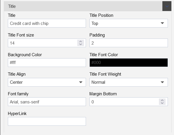
|---|---|
| Title: | Credit card with chip |
| Title Position: | Top |
| Title Font size: | 14 |
| Padding: | 2 |
| Background Color: | #ffffff |
| Title Font Color: | #000000 |
| Title Align: | Center |
| Title Font Weight: | Normal |
| Font family: | Arial,sans-serif |
| Mergin Bottom: | 0 |
| HyperLink | - |
- Add widget settings, click on the settings tab, as shown in the figure below:
Add Widget Box Shadow Properties as follows:
| Widget Box Shadow Properties | |
|---|---|
| Box Shadow checkbox | Click on the checkbox |
| Box Shadow Horizontal: | 1 |
| Box Shadow Vertical: | 1 |
| Box Shadow Color: | #189ab4 |
| Box Shadow Blur: | 2 |
| Box Shadow Spread: | 1 |
Add Widget Border Properties as follows:
| Widget Border Properties | |
|---|---|
| Border checkbox: | Click on border checkbox to enable the properties |
| Border Type: | Solid |
| Border Width: | 2px 2px 2px 2px |
| Border Color: | #189ab4 |
| Border Radius: | Click on border radius checkbox to enable the properties |
| Top Left Radius: | 10 |
| Top Right Radius: | 10 |
| Bottom Left Radius: | 10 |
| Bottom Right Radius: | 10 |
- Remove the Title form the widget using the Title Properties, click on the title properties, as shown in the figure below:
- Click on the Show Title toggle button to uncheck the title, as shown in the figure below:
- Click on the Save and Exit button to save the component.
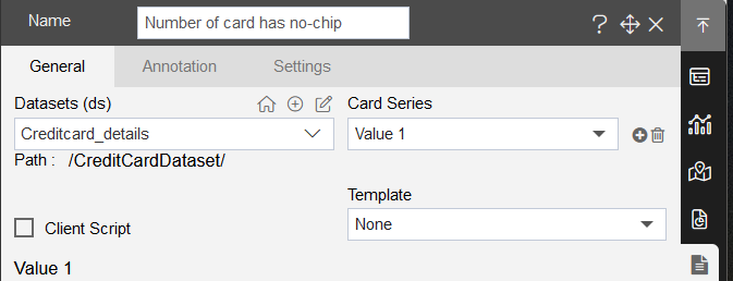
4. Number of card has no-chip (Card widget)
- Select the Card widget from the right-vertical menu bar, as shown in the figure below:
- follow the below steps to achieve this card widget:
| Enter widget name: | Number of card has no-chip |
|---|---|
| Datasets(ds) | Creditcard_details |
- After adding the card widget, add the below details in Value1, as shown in figure below:
- Insert following details in card widget:
| Card General | |
|---|---|
| Select Columns | Cards Issued |
| Aggregation | Sum |
| Filter column | Has Chip |
| Filter Value | NO |

| Style | |
|---|---|
| Font Size: | 26 |
| Padding: | 2 |
| Background Color: | #ffffff |
| Text Color: | #000000 |
| Align: | Center |
| Font Weight: | Normal |
| Font Family: | Arial,sens-serif |

| Card Title | |
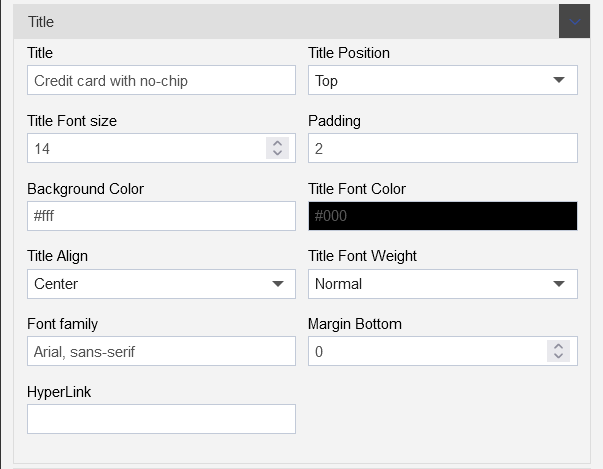
|---|---|
| Title: | Credit card with no-chip |
| Title Position: | Top |
| Title Font size: | 14 |
| Padding: | 2 |
| Background Color: | #ffffff |
| Title Font Color: | #000000 |
| Title Align: | Center |
| Title Font Weight: | Normal |
| Font family: | Arial,sans-serif |
| Mergin Bottom: | 0 |
| HyperLink | - |
- Add widget settings, click on the settings tab, as shown in the figure below:
Add Widget Box Shadow Properties as follows:
| Widget Box Shadow Properties | |
|---|---|
| Box Shadow checkbox | Click on the checkbox |
| Box Shadow Horizontal: | 1 |
| Box Shadow Vertical: | 1 |
| Box Shadow Color: | #189ab4 |
| Box Shadow Blur: | 2 |
| Box Shadow Spread: | 1 |
Add Widget Border Properties as follows:
| Widget Border Properties | |
|---|---|
| Border checkbox: | Click on border checkbox to enable the properties |
| Border Type: | Solid |
| Border Width: | 2px 2px 2px 2px |
| Border Color: | #189ab4 |
| Border Radius: | Click on border radius checkbox to enable the properties |
| Top Left Radius: | 10 |
| Top Right Radius: | 10 |
| Bottom Left Radius: | 10 |
| Bottom Right Radius: | 10 |
- Remove the Title form the widget using the Title Properties, click on the title properties, as shown in the figure below:
- Click on the Show Title toggle button to uncheck the title, as shown in the figure below:
- Click on the Save and Exit button to save the component.
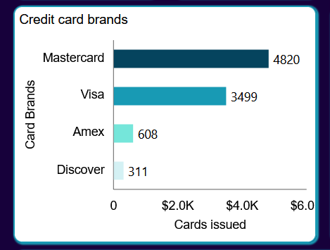
5. Credit card brands (Bar chart)
- Select the Chart widget form the right-vertical menu bar, as shown in the figure below:
| Select the chart widget | Select the column chart and clustered column chart |
|---|---|
 |  |
Add the chart dataset, formatting and setting details in Chart tab, as shown in the figure below:
Add the client script in column chart to add new value column:
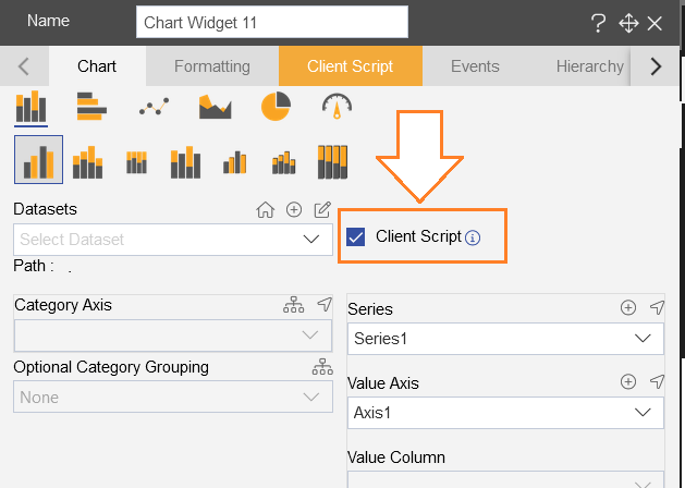
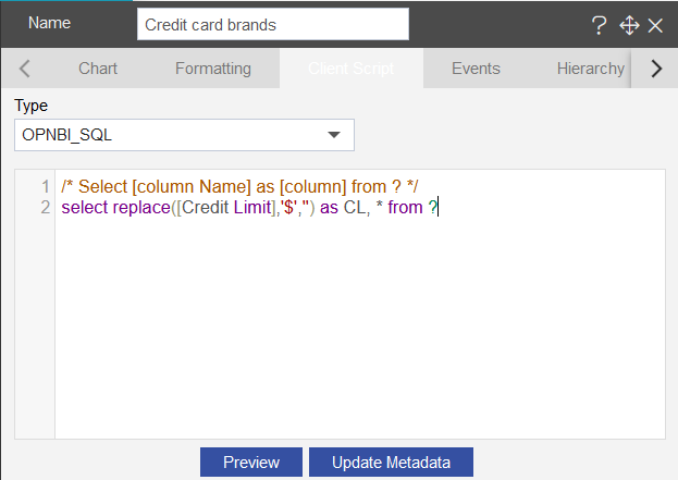
click on the Client script tab from upper menu bar.
Add the opnbi_code in the client script, as follows:
select replace([Credit Limit],'$','') as CL, * from ?
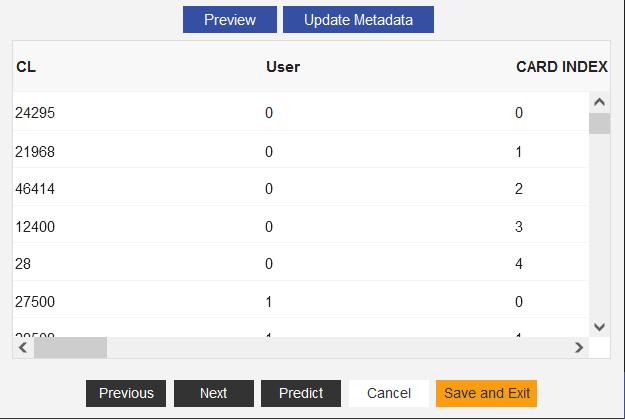
- Click on Preview button and as the preview of data appear under the code, click on the Update Metadata button, and the amt column will appear in the output as shown in the figure below:
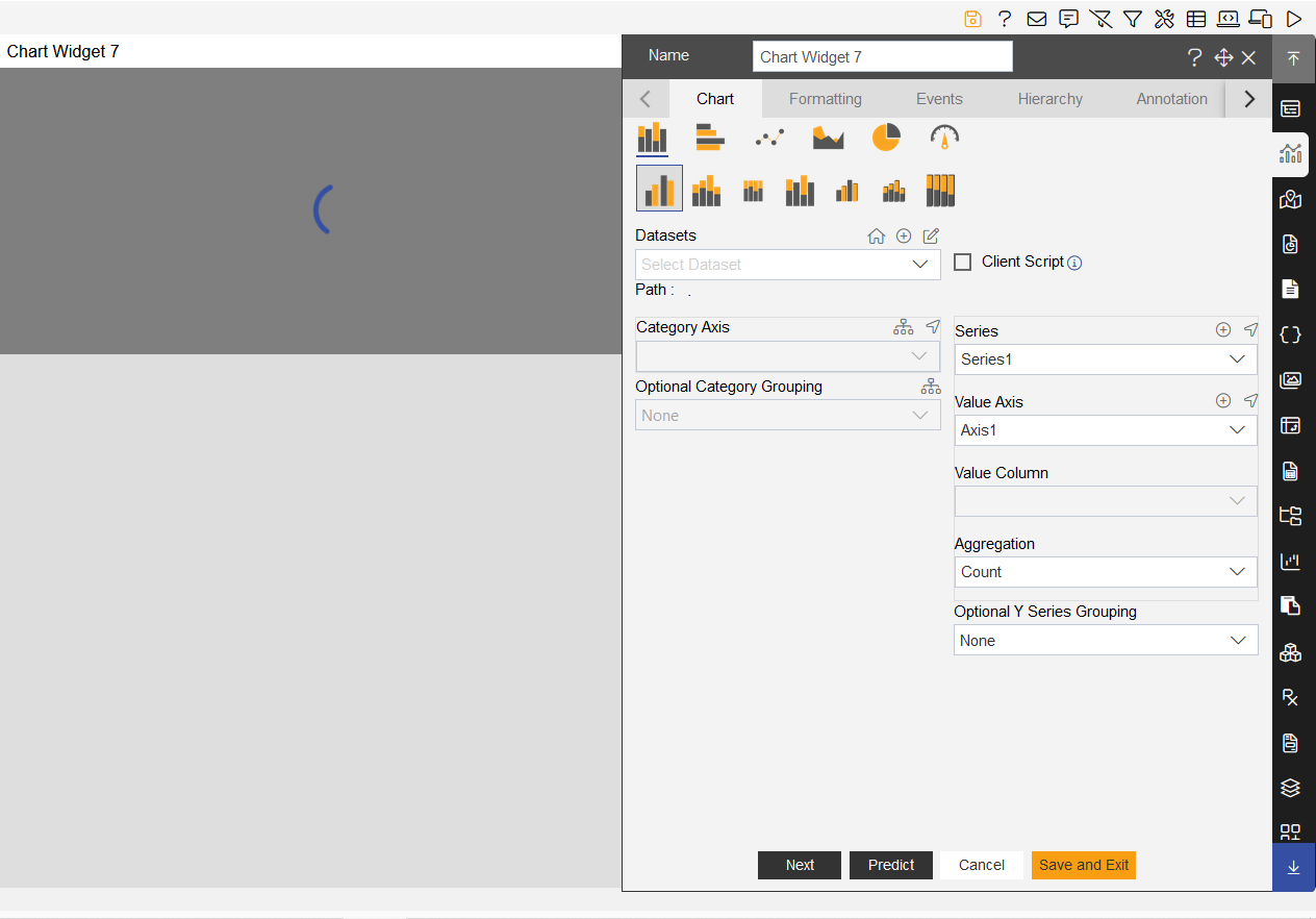
- Add below details in the chart tab as follows:
| Chart tab | |
|---|---|
| Char tab in edit settings | |
| Select chart: | select Bar chart |
| Select sub chart: | select Clustered chart |
| Widget Name: | Credit card brands |
| Datasets(ds): | Creditcard_details |
| Category Axis: | Card Brand |
| Value Axis: | Cards Issued |
| Aggregation: | Sum |
- Add below details in the general tab as follows:
- Go to Formatting tab to add required properties:
Add below details into the General Properties:
Select the Color and Theme Property, Add color in the Color List, as shown in the figure below:
#D4F1F4,#75E6DA,#189AB4,#05445E
- Click on Chart Sorting Based on value, Select the Sort Type: Ascending

- Click on the Chart cursor menu and disable the Line X and Line Y

- Click on Chart Scrollbar, Select Category Scrollbar: None and Value Scrollbar: None as shown in figure below:

Add below details into the Category Axis Properties:
Go to Category font property and Category ticks add below properties:
| Category Font Property | |
|---|---|
| Color: | #000000 |
| Font Size: | 14 |
| Font family: | Arial |
| Font Weight: | Normal |
| Opacity: | Keep the opacity maximum |
| Category Ticks | |
| Disable the ticks | Turn the toggle button off |
- Go to Category Title add below properties:
| Category Title: | Enable the title |
|---|---|
| Text: | Card Brands |
| Font family: | Arial |
| Font Size: | 14 |
| Font Weight: | Normal |
| Color: | #000000 |

- Add below details into the Value Axis Properties:
| Click on Number format |
|---|
| Enable the Number format toggle button |
| Enable the Abbreviation |
| Enable the Prefix from Abbreviation |
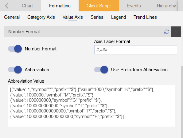
| Value font property | |
|---|---|
| Color: | #000000 |
| Font Size: | 14 |
| Font Family: | Arial |
| Font Weight: | Normal |
| Opacity: | Keep it maximum |
| Value Ticks | |
| Disable the value ticks | turn the toggle button off |

| Value Title | Enable the value title |
|---|---|
| Enable the Toggle button | Turn the toggle button on |
| Text: | Cards issued |
| Font Family: | Arial |
| Font Size: | 14 |
| Font Weight: | Normal |
| Color: | #000000 |

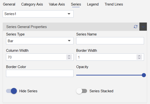
- Add below details into the Series Properties:
| Series general Properties | |
|---|---|
| Series Type: | Bar |
| Series Name: | (keep this empty) |
| Column Name: | 70 |
| Border Width: | 1 |
| Border Color: | - |
| Opacity: | keep the opacity maximum |
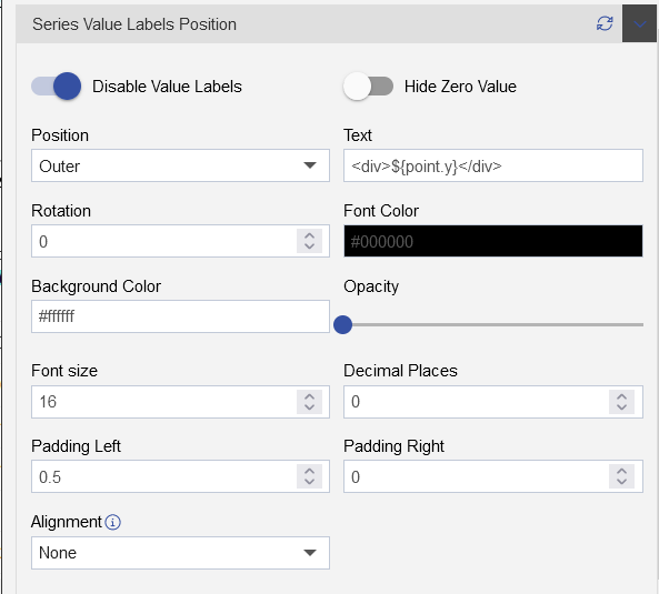
| Series Value Labels Position | |
|---|---|
| Enable the value labels | Turn the toggle button on |
| Position: | Outer |
| Text: | <div>${point.y}</div> |
| Rotation: | 0 |
| Font Color: | #000000 |
| Background-Color: | #ffffff |
| Opacity: | Keep the opcity minimum |
| Font Size: | 16 |
| Decimal Places: | 0 |
| Padding Left: | 0.5 |
| Padding Left: | 0 |
Add below details in the Setting properties:
Add widget Border shadow properties as follows:
| Widget Box Shadow Properties | |
|---|---|
| Box Shadow checkbox | Click on the checkbox |
| Box Shadow Horizontal: | 1 |
| Box Shadow Vertical: | 1 |
| Box Shadow Color: | #189ab4 |
| Box Shadow Blur: | 2 |
| Box Shadow Spread: | 1 |
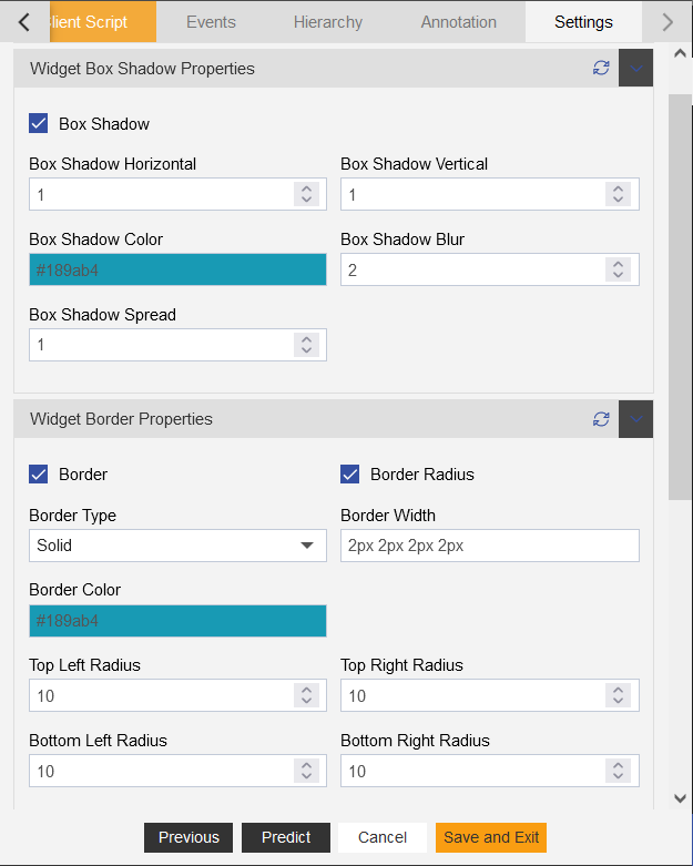
- Add Widget Border and Border Radius using the Widget Border Properties,select the Border and Border Radius toggle button as shown in the figure below:
- Add below details:
| Widget Border Properties | |
|---|---|
| Border checkbox: | Click on border checkbox to enable the properties |
| Border Type: | Solid |
| Border Width: | 2px 2px 2px 2px |
| Border Color: | #189ab4 |
| Border Radius: | Click on border radius checkbox to enable the properties |
| Top Left Radius: | 10 |
| Top Right Radius: | 10 |
| Bottom Left Radius: | 10 |
| Bottom Right Radius: | 10 |
Add Title Properties as follows:
| Title Properties | |
|---|---|
| Show Title: | Click on the Title checkbox to enable the properties |
| Title Move To: | Left |
| Title Color: | #000000 |
| Title Font Size: | 15 |
| Title Font Style: | Normal |
| Title Font Family: | - |
| Title Font Weight: | Normal |
| Title Background Color: | transparent |
| Padding: | 5px 5px 5px 5px |
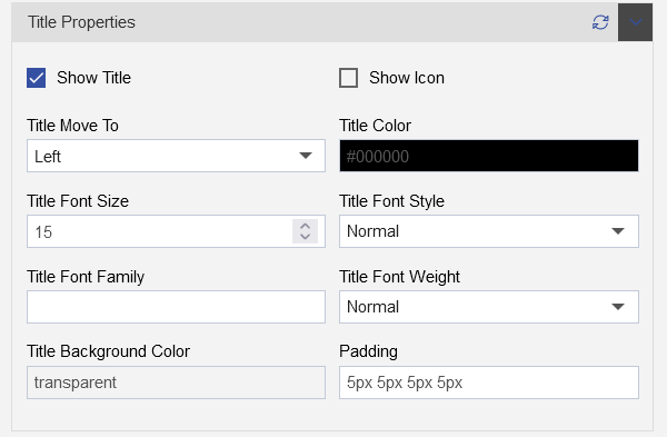
Click on Save and Exit button

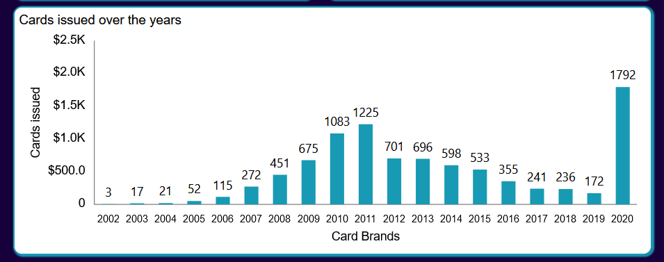
6. Cards issued over the years (Column chart)
- Select the Chart widget form the right-vertical menu bar, as shown in the figure below:
| Select the chart widget | Select the column chart and clustered column chart |
|---|---|
| |
- Add the chart dataset, formatting and setting details in Chart tab, as shown in the figure below:
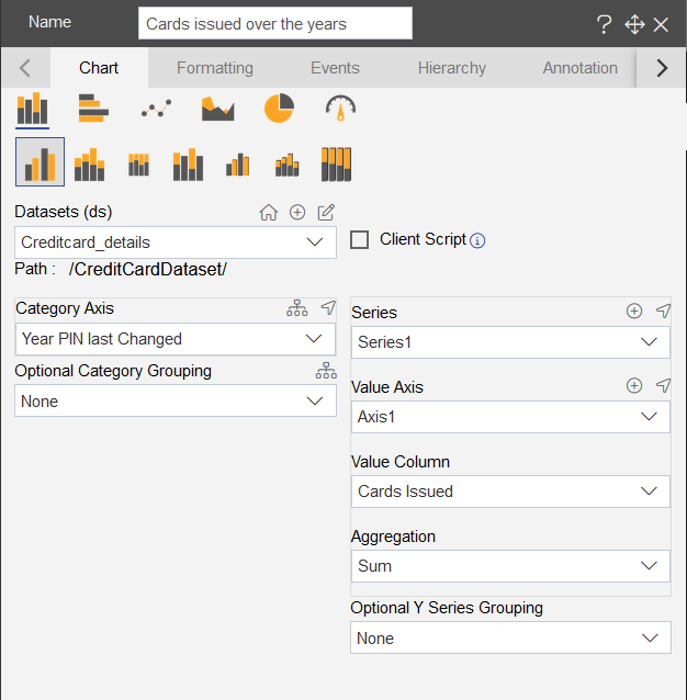
- Add below details in the chart tab as follows:
| Chart tab | |
|---|---|
| Char tab in edit settings | |
| Select chart: | select Column chart |
| Select sub chart: | select Column Clustered chart |
| Widget Name: | Cards issued over the years |
| Datasets(ds): | Creditcard_details |
| Category Axis: | Year PIN last Changed |
| Value Axis: | Cards Issued |
| Aggregation: | Sum |
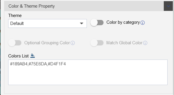
- Go to Formatting tab to add required properties:
Add below details into the General Properties:
Select the Color and Theme Property, Add color in the Color List, as shown in the figure below:
#189AB4,#75E6DA,#D4F1F4
- Click on the Chart cursor menu and disable the Line X and Line Y
Add below details into the Category Axis Properties:
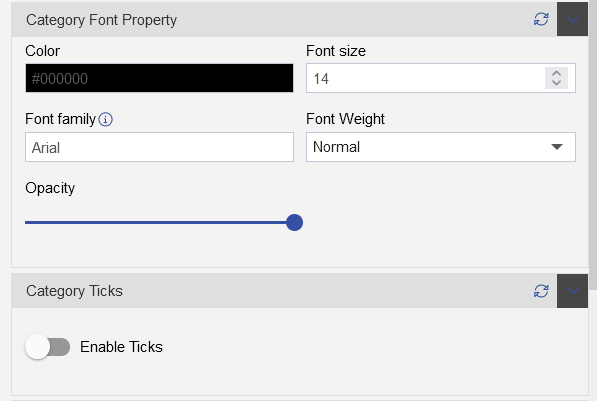
Go to Category font property and Category ticks add below properties:
| Category Font Property | |
|---|---|
| Color: | #000000 |
| Font Size: | 14 |
| Font family: | Arial |
| Font Weight: | Normal |
| Opacity: | Keep the opacity maximum |
| Category Ticks | |
| Disable the ticks | Turn the toggle button off |
- Go to Category Title add below properties:
| Category Title: | Enable the title |
|---|---|
| Text: | Card Brands |
| Font family: | Arial |
| Font Size: | 14 |
| Font Weight: | Normal |
| Color: | #000000 |

- Add below details into the Value Axis Properties:
| Click on Number format |
|---|
| Enable the Number format toggle button |
| Enable the Abbreviation |
| Enable the Prefix from Abbreviation |
| Value font property | |
|---|---|
| Color: | #000000 |
| Font Size: | 14 |
| Font Family: | Arial |
| Font Weight: | Normal |
| Opacity: | Keep it maximum |
| Value Ticks | |
| Disable the value ticks | turn the toggle button off |
| Value Title | Enable the value title |
|---|---|
| Enable the Toggle button | Turn the toggle button on |
| Text: | Cards issued |
| Font Family: | Arial |
| Font Size: | 14 |
| Font Weight: | Normal |
| Color: | #000000 |
- Add below details into the Series Properties:
| Series general Properties | |
|---|---|
| Series Type: | Column |
| Series Name: | (keep this empty) |
| Column Name: | 70 |
| Border Width: | 0 |
| Border Color: | - |
| Opacity: | keep the opacity maximum |
| Series Value Labels Position | |
|---|---|
| Enable the value labels | Turn the toggle button on |
| Position: | Outer |
| Text: | <div>${point.y}</div> |
| Rotation: | 0 |
| Font Color: | #000000 |
| Background-Color: | #ffffff |
| Opacity: | Keep the opcity minimum |
| Font Size: | 14 |
| Decimal Places: | 0 |
| Padding Left: | 0 |
| Padding Left: | 0 |
Add below details in the Setting properties:
Add widget Border shadow properties as follows:
| Widget Box Shadow Properties | |
|---|---|
| Box Shadow checkbox | Click on the checkbox |
| Box Shadow Horizontal: | 1 |
| Box Shadow Vertical: | 1 |
| Box Shadow Color: | #189ab4 |
| Box Shadow Blur: | 2 |
| Box Shadow Spread: | 1 |
- Add Widget Border and Border Radius using the Widget Border Properties,select the Border and Border Radius toggle button as shown in the figure below:
- Add below details:
| Widget Border Properties | |
|---|---|
| Border checkbox: | Click on border checkbox to enable the properties |
| Border Type: | Solid |
| Border Width: | 2px 2px 2px 2px |
| Border Color: | #189ab4 |
| Border Radius: | Click on border radius checkbox to enable the properties |
| Top Left Radius: | 10 |
| Top Right Radius: | 10 |
| Bottom Left Radius: | 10 |
| Bottom Right Radius: | 10 |
Add Title Properties as follows:
| Title Properties | |
|---|---|
| Show Title: | Click on the Title checkbox to enable the properties |
| Title Move To: | Left |
| Title Color: | #000000 |
| Title Font Size: | 15 |
| Title Font Style: | Normal |
| Title Font Family: | - |
| Title Font Weight: | Normal |
| Title Background Color: | transparent |
| Padding: | 5px 5px 5px 5px |
Click on Save and Exit button
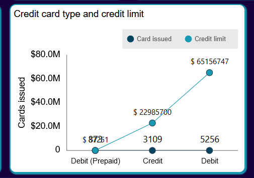
7. Credit card type and credit limit (Line chart)
- Select the Chart widget form the right-vertical menu bar, as shown in the figure below:
| Select the chart widget | Select the column chart and clustered column chart |
|---|---|
| |
Add the chart dataset, formatting and setting details in Chart tab, as shown in the figure below:
Add the client script in column chart to add new value column:
click on the Client script tab from upper menu bar.
Add the opnbi_code in the client script, as follows:
select replace([Credit Limit],'$','') as CL, * from ?
- Click on Preview button and as the preview of data appear under the code, click on the Update Metadata button, and the amt column will appear in the output as shown in the figure below:
- Add the chart dataset, formatting and setting details in Chart tab, as shown in the figure below:
- Add below details in the chart tab as follows:
| Chart tab | |
|---|---|
| Char tab in edit settings | |
| Select chart: | select Line chart |
| Select sub chart: | select Line Stacked chart |
| Widget Name: | Credit card type and credit limit |
| Datasets(ds): | Creditcard_details |
| Category Axis: | Card Type |
| Value Axis: | Cards Issued |
| Aggregation: | Sum |
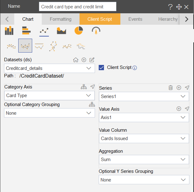
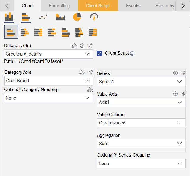
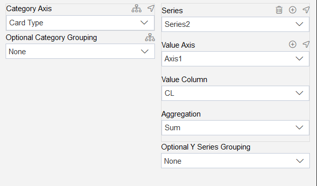
- Add series2 from Plus icon(+) beside the series title, as shown in below figure:

- Add below details in the series2:
| Category Axis: | Card Type |
|---|---|
| Series: | Series2 |
| Value Axis: | Axis1 |
| Value Column: | CL |
| Aggregation: | Sum |
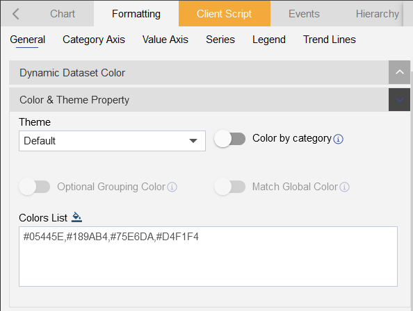
- Go to Formatting tab to add required properties:
Add below details into the General Properties:
Select the Color and Theme Property, Add color in the Color List, as shown in the figure below:
#05445E,#189AB4,#75E6DA,#D4F1F4
- Click on Chart Sorting Based on value, Select the Sort Type: Ascending
- Click on the Chart cursor menu and disable the Line X and Line Y
Add below details into the Category Axis Properties:
Go to Category font property and Category ticks add below properties:
| Category Font Property | |
|---|---|
| Color: | #000000 |
| Font Size: | 14 |
| Font family: | Arial |
| Font Weight: | Normal |
| Opacity: | Keep the opacity maximum |
| Category Ticks | |
| Disable the ticks | Turn the toggle button off |
- Go to Category Title, disable the category title.

- Add below details into the Value Axis Properties:
| Click on Number format |
|---|
| Enable the Number format toggle button |
| Enable the Abbreviation |
| Enable the Prefix from Abbreviation |
| Value Font Property | |
|---|---|
| Color: | #000000 |
| Font Size: | 14 |
| Font Family: | Arial |
| Font Weight: | Normal |
| Opacity: | Keep it maximum |
| Value Ticks | |
| Disable the value ticks | turn the toggle button off |
| Value Title | Enable the value title |
|---|---|
| Enable the Toggle button | Turn the toggle button on |
| Text: | Cards issued |
| Font Family: | Arial |
| Font Size: | 14 |
| Font Weight: | Normal |
| Color: | #000000 |

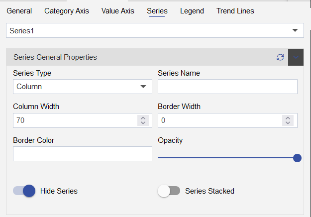
Add below details into the Series Properties:
Select Series1:
| Series general Properties | |
|---|---|
| Series Type: | Line |
| Series Name: | Card Issued |
| Border Width: | 1 |
| Border Color: | - |
| Opacity: | (keep the opacity maximum) |

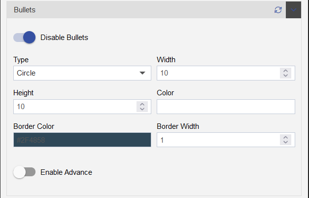
- Click on the Bullets, Enable the Bullets in chart by enabling the toggle button.
| Bullets | |
|---|---|
| Type: | Circle |
| Width: | 10 |
| Height: | 10 |
| Color: | Keep it empty |
| Border Color: | #2f4858 |
| Border Width: | 1 |
| Enable Advance Toggle button: | Keep it disable |
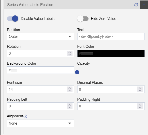
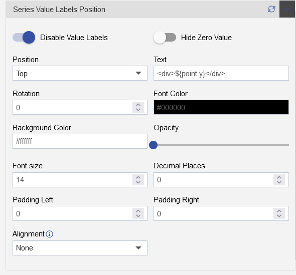
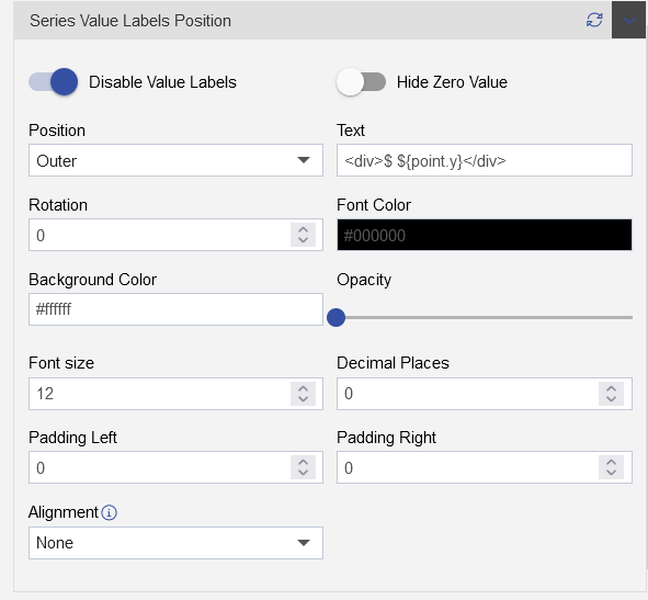
| Series Value Labels Position | |
|---|---|
| Enable the value labels | Turn the toggle button on |
| Position: | Top |
| Text: | <div>${point.y}</div> |
| Rotation: | 0 |
| Font Color: | #000000 |
| Background-Color: | #ffffff |
| Opacity: | Keep the opcity minimum |
| Font Size: | 14 |
| Decimal Places: | 0 |
| Padding Left: | 0 |
| Padding Left: | 0 |
- Select Series2:
| Series general Properties | |
|---|---|
| Series Type: | Line |
| Series Name: | Credit limit |
| Border Width: | 1 |
| Border Color: | - |
| Opacity: | (keep the opacity maximum) |

- Click on the Bullets, Enable the Bullets in chart by enabling the toggle button.
| Bullets | |
|---|---|
| Type: | Circle |
| Width: | 10 |
| Height: | 10 |
| Color: | Keep it empty |
| Border Color: | #2f4858 |
| Border Width: | 1 |
| Enable Advance Toggle button: | Keep it disable |
| Series Value Labels Position | |
|---|---|
| Enable the value labels | Turn the toggle button on |
| Position: | Top |
| Text: | <div>$ ${point.y}</div> |
| Rotation: | 0 |
| Font Color: | #000000 |
| Background-Color: | #ffffff |
| Opacity: | Keep the opcity minimum |
| Font Size: | 12 |
| Decimal Places: | 0 |
| Padding Left: | 0 |
| Padding Left: | 0 |
Add below details in the Legend Properties:
Click on Legend tab and add below details into the Legend properties:
| Select the Legend Properties | |
|---|---|
| Enable the Legend | click on the legend toggle button to add legends into the widget. |

| Legend Alignment property | |
|---|---|
| Content Align: | Right |
| Position: | Top |
| Legend Width: | 25 |
| Legend Height: | 50 |

| Inherit Property from Series | |
|---|---|
| Disable the Default Marker | Click on the toggle button to disable the default marker |

| Legend Font property | |
|---|---|
| Font family: | Arial |
| Font Size: | 12 |
| Font Weight: | Normal |
| Legend Color: | #000000 |

| Legend Background | |
|---|---|
| Background Color: | #d3d3d3 |
| Background Opacity: | Keep the opacity half(0.5) |

Add below details in the Setting properties:
Add widget Border shadow properties as follows:
| Widget Box Shadow Properties | |
|---|---|
| Box Shadow checkbox | Click on the checkbox |
| Box Shadow Horizontal: | 1 |
| Box Shadow Vertical: | 1 |
| Box Shadow Color: | #189ab4 |
| Box Shadow Blur: | 2 |
| Box Shadow Spread: | 1 |
- Add Widget Border and Border Radius using the Widget Border Properties,select the Border and Border Radius toggle button as shown in the figure below:
- Add below details:
| Widget Border Properties | |
|---|---|
| Border checkbox: | Click on border checkbox to enable the properties |
| Border Type: | Solid |
| Border Width: | 2px 2px 2px 2px |
| Border Color: | #189ab4 |
| Border Radius: | Click on border radius checkbox to enable the properties |
| Top Left Radius: | 10 |
| Top Right Radius: | 10 |
| Bottom Left Radius: | 10 |
| Bottom Right Radius: | 10 |
Add Title Properties as follows:
| Title Properties | |
|---|---|
| Show Title: | Click on the Title checkbox to enable the properties |
| Title Move To: | Left |
| Title Color: | #000000 |
| Title Font Size: | 15 |
| Title Font Style: | Normal |
| Title Font Family: | - |
| Title Font Weight: | Normal |
| Title Background Color: | transparent |
| Padding: | 5px 5px 5px 5px |
Click on Save and Exit button
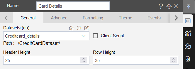
8. Card Details
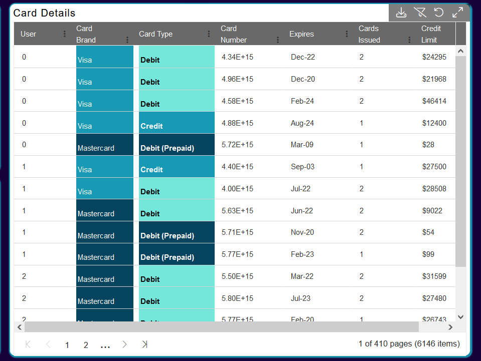
Select the Table widget from the right-vertical menu-bar.
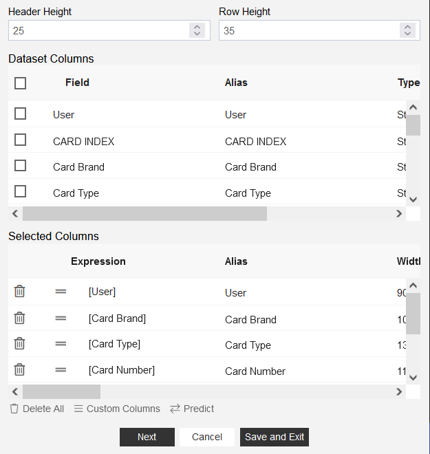
Select the Datasets(ds) as Creditcard_details.
Add Header Height: 25 and Row Height: 35
- Select all the columns from the available columns, To select all columns, Check the checkbox under the Dataset Column as shown in the figure below:
- Add condition using the custom column, select the custom column, as shown in the figure below:

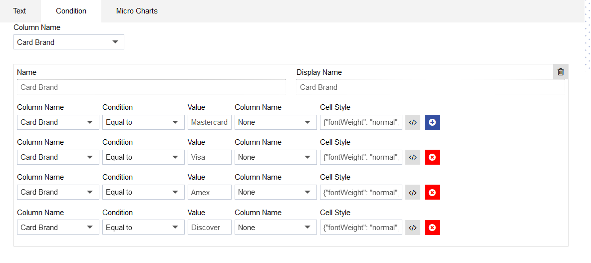
- From the Custom Column Dialog box, click on the Condition tab and select the column from the dropdown to add conditions:

- Select the Card brand from the Column name.

- After selecting the Column name, add below details:
| Name: | Card Brand |
|---|---|
| Display Name: | Card Brand |
| Column name: | Card Brand |
| Condition: | Equal to |
| Value: | Mastercard |
| Cell Style: | Click on code layout button and add code: {"fontWeight": "normal", "backgroundColor": "#05445E", "color":"#ffffff"} |
| Click on Save button | Click on (+) Plus icon and add another condition |
| Display Name: | Card Brand |
| Column name: | Card Brand |
| Condition: | Equal to |
| Value: | Visa |
| Cell Style: | Click on code layout button and add code: {"fontWeight": "normal", "backgroundColor": "#189AB4", "color":"#ffffff"} |
| Click on Save button | Click on (+) Plus icon and add another condition |
| Display Name: | Card Brand |
| Column name: | Card Brand |
| Condition: | Equal to |
| Value: | Amex |
| Cell Style: | Click on code layout button and add code: {"fontWeight": "normal", "backgroundColor": "#75E6DA", "color":"#ffffff"} |
| Click on Save button | Click on (+) Plus icon and add another condition |
| Display Name: | Card Brand |
| Column name: | Card Brand |
| Condition: | Equal to |
| Value: | Discover |
| Cell Style: | Click on code layout button and add code: {"fontWeight": "normal", "backgroundColor": "#D4F1F4", "color":"#000000"} |
| Click on Save button | |
| Click on Add Button |
- Click on formatting tab, go to Miscellaneous Properties as shown in the figure below:
- Add Below properties:
| Miscellaneous Properties: | |
|---|---|
| Pagination: | Click on the pagination checkbox |
| Pagination Size: | 10 |
| Text Wrap: | Click on the text wrap checkbox |
| Theme: | Content |

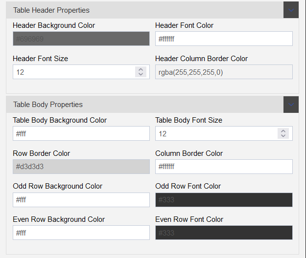
- Click on Theme tab and add Table header and body properties as follows:
| Table header properties | Table Body Properties | ||
|---|---|---|---|
| Header background color: | #696969 | Table body background color: | #ffffff |
| Header Font Color: | #ffffff | Table body font size: | 12 |
| Header Font Size: | 12 | Row Border Color: | #d3d3d3 |
| Header Column Border Color: | rgba(255,255,255,0) | Column Border Color: | #ffffff |
| Odd Row Background Color: | #ffffff | ||
| Odd Row Font Color: | #000000 | ||
| Evan Row Background Color: | #ffffff | ||
| Evan Row Font Color: | #000000 |
- Add Widget Setting, click on the Setting tab, as shown in the figure below:
- Add Widget Box Shadow Properties as follows:
| Widget Box Shadow Properties | |
|---|---|
| Box Shadow checkbox | Click on the checkbox |
| Box Shadow Horizontal: | 1 |
| Box Shadow Vertical: | 1 |
| Box Shadow Color: | #189ab4 |
| Box Shadow Blur: | 2 |
| Box Shadow Spread: | 1 |
- Add Widget Border Properties as follows:
| Widget Border Properties | |
|---|---|
| Border checkbox: | Click on border checkbox to enable the properties |
| Border Type: | Solid |
| Border Width: | 2px 2px 2px 2px |
| Border Color: | #189ab4 |
| Border Radius: | Click on border radius checkbox to enable the properties |
| Top Left Radius: | 10 |
| Top Right Radius: | 10 |
| Bottom Left Radius: | 10 |
| Bottom Right Radius: | 10 |
- Click on save and exit button to complete the component.
9. Select Card Brand (Filter)
- Follow below steps to add filter in the dashboard:
Click on the Filters icon from the Top-right corner of the dashboard.
Click on the Plus icon to add the filter, as shown in the figure below:

- Add Name: Select card brand and click on the Wright icon, the filter will appear in the filter dialog box:

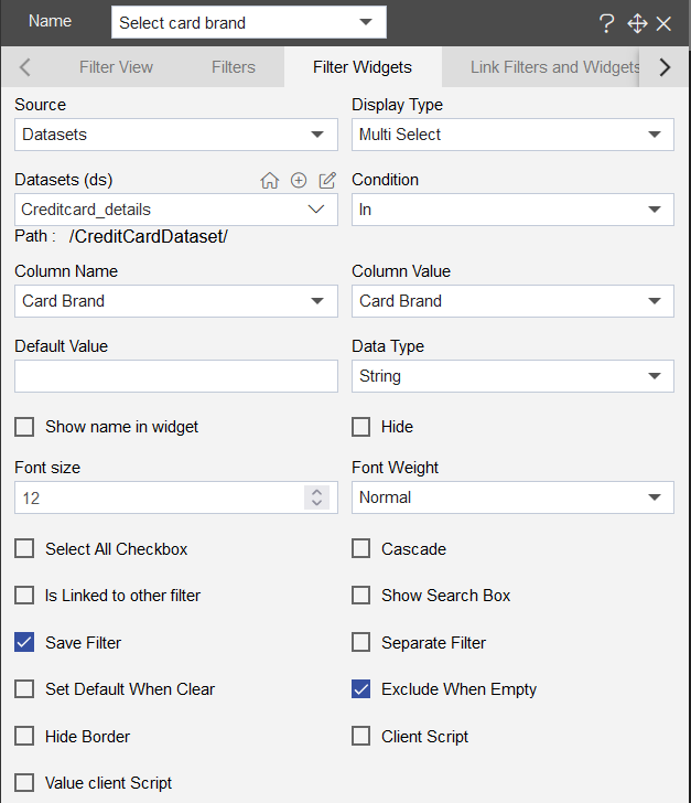
- Click on the Filter edit icon, and add below proeprties to make connection between Widgets and Filters:
| Filter widgets: | |
|---|---|
| Source: | Datasets |
| Display Type: | Multi Select |
| Datasets (ds): | Creditcard_details |
| Condition: | In |
| Column Name: | Card Brand |
| Column Value: | Card Brand |
| DataType: | String |
| Font Size: | 12 |
| Font Weight: | Normal |
- Link Filters and Widgets tab:
- Layer: Layer 1
- Tabs: Credit card Details
- Widget: Select the widgets and select the card brand column field from the Available columns
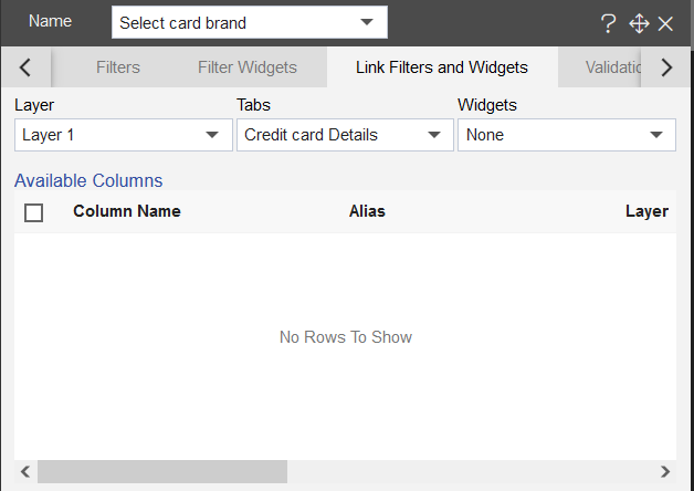
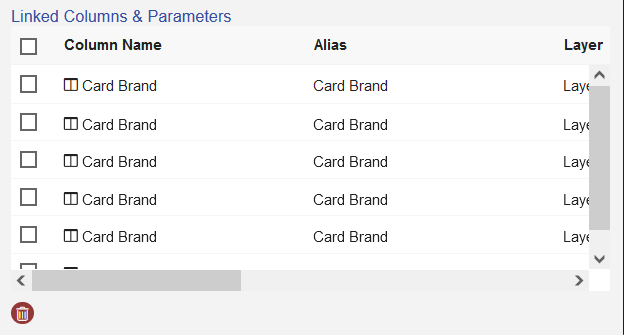
- As you select the widget, the available column will show up in the avilable column box, selcet the Card Brand column from Available columns, and the selected column will appear in the linked columns & Parameters.
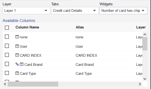
- Select all the widget of the creditcard detail solution, and select the Card Brand column, as shown in the figure below:
- Click on the Filter View from the Top menu bar, and click on the Plus icon (+) as shown in the figure below:

- As you click on the plus icon, the filter will appear on the dashboard.
10. Select Card Type (Filter)
- Follow below steps to add filter in the dashboard:
Click on the Filters icon from the Top-right corner of the dashboard.
Click on the Plus icon to add the filter, as shown in the figure below:
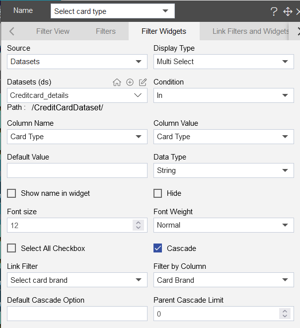
- Add Name: Select card type and click on the Wright icon, the filter will appear in the filter dialog box:

- Click on the Filter edit icon, and add below proeprties to make connection between Widgets and Filters:
| Filter widgets: | |
|---|---|
| Source: | Datasets |
| Display Type: | Multi Select |
| Datasets (ds): | Creditcard_details |
| Condition: | In |
| Column Name: | Card Type |
| Column Value: | Card Type |
| DataType: | String |
| Font Size: | 12 |
| Font Weight: | Normal |
- Select the Cascade checkbox and add Link Filter: Select card brand, Filter by Column: Card Brand
- Link Filters and Widgets tab:
- Layer: Layer 1
- Tabs: Credit card Details
- Widget: Select the widgets and select the card brand column field from the Available columns
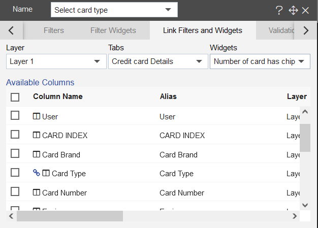
- As you select the widget, the available column will show up in the avilable column box, selcet the Card Type column from Available columns, and the selected column will appear in the linked columns & Parameters.
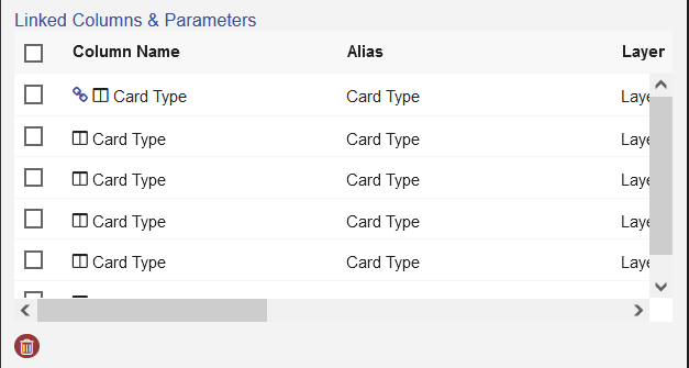
- Select all the widget of the creditcard detail solution, and select the Card Type column, as shown in the figure below:
- Click on the Filter View from the Top menu bar, and click on the Plus icon (+) as shown in the figure below:

- As you click on the plus icon, the filter will appear on the dashboard.