Employee Data Dashboard
Introduction
Employee Data Dashboard contains the Dta related to the Employee. For example; Department, LeadSource, Work Priority, Their Contact & Email Details & much more..
Employee Data Dashboard contains 3tabs:-
- 1. Overview
- 2. Employee Data
- 3. Detail Data
Prerequisite
Dataset: s_contacts
The dataset of this project is made by connection salesforce to the opnbi To know how to connect salesforce with opnbi go through this document.
Overview Tab
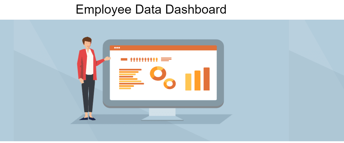
- Title -> Employee Data Dashboard
Create a Custom Visualization widget. (To know how to create custom visualization widget click here)a
Write HTML code in Custom Visualization HTML tab.
User can get that HTML code from Employee Data Dashboard -> HTML -> Title_html.txt file.
As you click on Save & Exit, it will shown as below:

User need to click on the Title & their screen will shown as below:
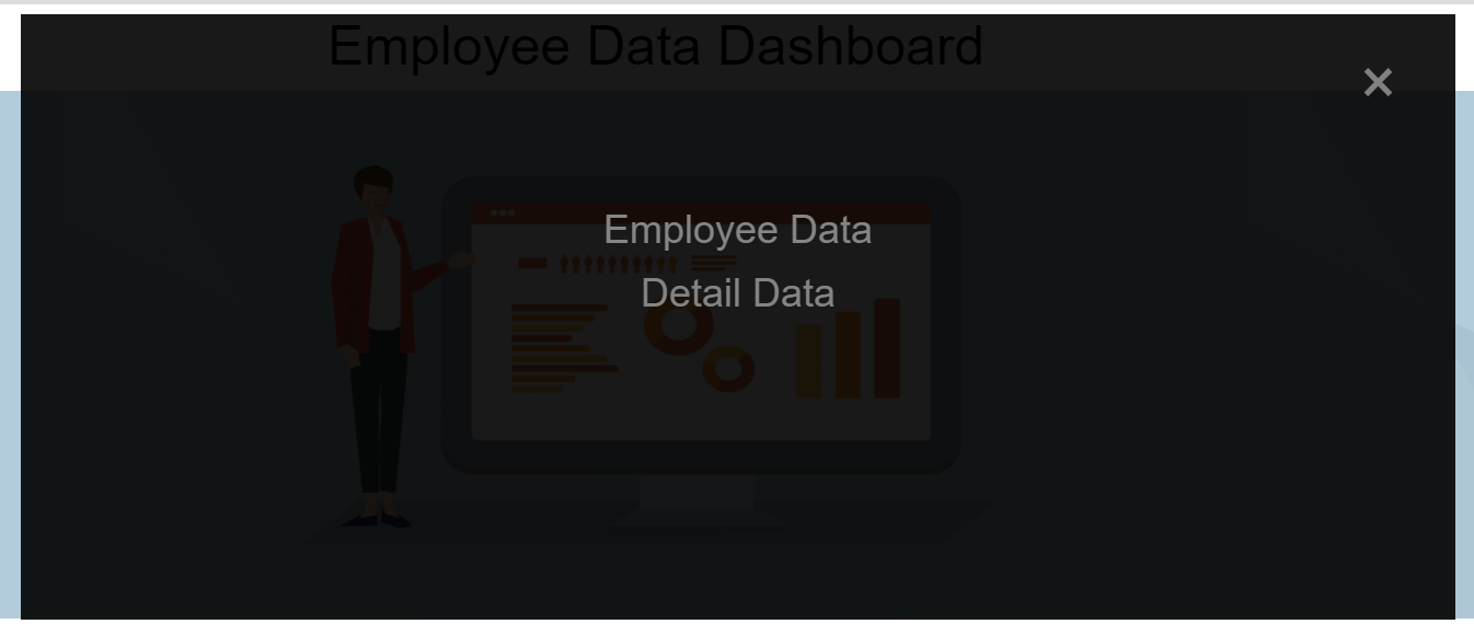
By licking on the respective tab user can rdirected to that tab of the dashboard.
Emloyee Data
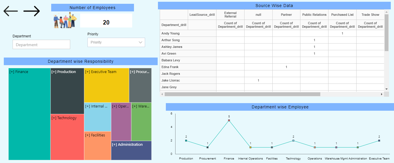
This tab contains 2 Filters, 1 KPIs, 2 Custom Visualization widget & 3 different widgets.
KPI -> Number of Employees
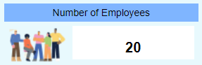
Displays the total Number of Empoyees.
- Select card widget from the ertical menu & fill the below details:
Title: Number of Employees
Datasets: s_contacts
- In Card General tab:
Select Columns: Name
Aggregation: Count
- In Formatting tab:
Decimal Place: 0
- In Image tab:
Toggle Use Image button
Image Path: select gif-unscreen.gif
Position: Left
- Go to Settings properties & update details as shown:
- In Background Properties tab:
Panel Background Color: rgba(255,255,255,0)
Maximize Widget Background Color: rgba(255,255,255,0)
Widget Background COlor: rgba(255,255,255,0)
- In Title tab:
Title Move To: Center
Title Font Size: 14
Title Background Color: #7fb5ff
- Click on Save and Exit button.
Tree Map Widget -> Department wise Responsibility
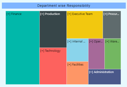
Displays the Department wise Reponsibility of Work.
- Select Chart Widget -> Tree Map Chart from the vertical menu & fill the details as shown:
Title: Department wise Responsibility
Datasets: s_contacts
- Go to the Hierarchy tab & updae as follows:
- Select Department, LaedSource & Level_c from the column respectively & Click on Add Hierarchy button.
- Go to the Chart tab & update details as follow:
Category Axis: Department_drill
Aggregation: count
- Go to the Formatting tab & expand Chart Tooltip optiion:
Tooltip Text: ${point.x} : ${point.y}
Now, Go to the Settings Properties & update as shown:
In Background Properties tab:
Panel Background Color: rgba(255,255,255,0)
Maximize Widget Background Color: rgba(255,255,255,0)
Widget Background COlor: rgba(255,255,255,0)
- In Title tab:
Title Move To: Center
Title Font Size: 14
Title Background Color: #7fb5ff
- Click on Save and Exit button.
Pivot Widget -> Source Wise Data
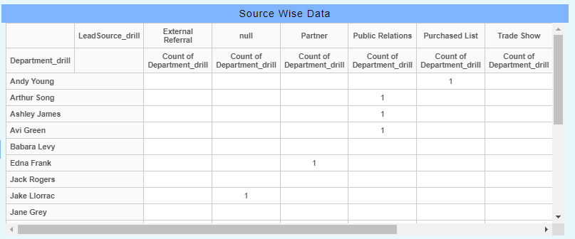
Displays the Source wise Data of the Employees.
- Select Pivot widget from the right vertical menu & fill the details as shown:
Title:  Source wise Data
Datasets: s_contacts
- Now, go to the Hierarchy tab & update details as shown:
- Select Department & Name respectively to make Department_drill herarchy.
- Select LeadSource & Languages__c respectively to make LeadSource_drill hierarchy.
- Go to Pivot tab & update details as shown:
- Select Depaartment_drill to Rows from Dataset Columns.
- Select LeadSource_drill to Rows from Dataset Columns.
Now, Go to the Settings Properties & update as shown:
In Background Properties tab:
Panel Background Color: rgba(255,255,255,0)
Maximize Widget Background Color: rgba(255,255,255,0)
Widget Background COlor: rgba(255,255,255,0)
- In Title tab:
Title Move To: Center
Title Font Size: 14
Title Background Color: #7fb5ff
- Clickon Save and Exit button.
Line Chart Widget -> Department wise Employee
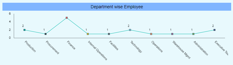
Displays the data of Depaartment wise Total Number of Employees.
- Select Chart Widget -> Line Chart from the vertical menu & fill the details as shown:
>   Title: Department wise Employee
>   Datasets: s_contacts
>   Category Axis: Department
>   Value Column: Name
>   Aggregation: Count
Go to the General Property & update the details as shown:
Expand Color & Theme tab & toggle Color by Category button.
Expand Chart Background Area & update details as shown:
Background Opacity: 0
- Expand Chart Tooltip & update details as shown:
Tooltip Text: ${point.x} : ${point.y}
Go to the Category Axis Property & update the details as shown:
Expand the Category Ticks tab & toggle the Disable Ticks.
Go to the Value Axis Property & update the details as shown:
Expand the Value Ticks tab & toggle the Disable Ticks.
Go to the Series Property tab -> Series Value Labels Position & update detaails as shown:
Toggle Enable Vaalue Labels
Position: Outer
Decimal Places: 2
- Expand Bullets tab & update the details as shown:
Type: Square
Width: 5
Height: 5
Border Color: #2F4858
Border Width: 1
Now, Go to the Settings Properties & update as shown:
In Background Properties tab:
Panel Background Color: rgba(255,255,255,0)
Maximize Widget Background Color: rgba(255,255,255,0)
Widget Background COlor: rgba(255,255,255,0)
- In Title tab:
Title Move To: Center
Title Font Size: 14
Title Background Color: #7fb5ff
- Click on Save and Exit button.
Filter: 1 -> Department

By using this filter user can filter out the data of Employee Data tab by Department.
Click on the Filters button
 from the top right corner.
Click on
 & fill the details as shown:
Name: Department
- Then click on right arrow.
Event: On Chnage
- Then click on the gear icon in fornt of Department Filter & fill the details as shown:
Source: Datasets
Datasets: s_contacts
Column Name: Department
Check the Set Default when Clear checkbox
- Go to Link Filters and Widgets & update as follows:
Layer: Layer 1
Tabs: Employee Data
Widgets: Select all the widgets one by one available in the tab
Select Department from the Available Columns & it will be available in Linked Columns & Parameters. (Do the same procees while selecting all available widgets in the tab)
Go to the Filter View & & click on (+) icon. Then click on Save & Exit button.
Go to the Widget Settings icon on the Department filter & update as follow:
- In Background Properties tab:
Panel Background Color: rgba(255,255,255,0)
Maximize Widget Background Color: rgba(255,255,255,0)
Widget Background COlor: rgba(255,255,255,0)
- In Title tab:
Uncheck Show Title box
- Click on Save and Exit button.
Filter: 2 -> Priority

By using this filter user can filter out the data of Employee Data tab by Priority Levels.
Click on the Filters button
from the top right corner.Click on
& fill the details as shown:
Name: Priority
- Then click on right arrow.
Event: On Chnage
- Then click on the gear icon in fornt of Priority Filter & fill the details as shown:
Source: Datasets
Datasets: s_contacts
Column Name: Level__c
Check the Set Default when Clear checkbox
Check the Cascade checkbox
Link Filter: Department
Filtere by Column: Department
Cascade filters are ones where the selection on the first filter causes the second to be limited to only those values that are now relevant.
Go to Link Filters and Widgets & update as follows:
Layer: Layer 1
Tabs: Employee Data
Widgets: Select all the widgets one by one available in the tab
Select Level__c from the Available Columns & it will be available in Linked Columns & Parameters. (Do the same procees while selecting all available widgets in the tab)
Go to the Filter View & & click on (+) icon. Then click on Save & Exit button.
Go to the Widget Settings icon on the Priority filter & update as follow:
- In Background Properties tab:
Panel Background Color: rgba(255,255,255,0)
Maximize Widget Background Color: rgba(255,255,255,0)
Widget Background COlor: rgba(255,255,255,0)
- In Title tab:
Uncheck Show Title box
- Click on Save and Exit button.
Custom Visualization Widget: 1 -> Previous button

By using this button user can go to the Previous Tab of the Dashboard.
Select Custom Visualization Widget from the right vertical menu & update details as follows:
Write HTML & CSS code in their respective tab.
User can get that HTML code from Employee Data Dashboard -> HTML -> Previous-1_html.txt & CSS code from Employee Data Dashord -> CSS -> Previous-1_css.txt file.
Go to the Widget Settings icon on the Priority filter & update as follow:
- In Background Properties tab:
Panel Background Color: rgba(255,255,255,0)
Maximize Widget Background Color: rgba(255,255,255,0)
Widget Background COlor: rgba(255,255,255,0)
- In Title tab:
Uncheck Show Title box
- Click on Save and Exit button.
Custom Visualization Widget: 2 -> Next button

By using this button usercan go to the Next Tab of the Dashboard.
Select Custom Visualization Widget from the right vertical menu & update details as follows:
Write HTML & CSS code in their respective tab.
User can get that HTML code from Employee Data Dashboard -> HTML -> Next-1_html.txt & CSS code from Employee Data Dashord -> CSS -> Next-1_css.txt file.
Go to the Widget Settings icon on the Priority filter & update as follow:
- In Background Properties tab:
Panel Background Color: rgba(255,255,255,0)
Maximize Widget Background Color: rgba(255,255,255,0)
Widget Background COlor: rgba(255,255,255,0)
- In Title tab:
Uncheck Show Title box
- Click on Save and Exit button.
Detail Data
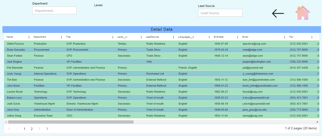
This tab contains 3 Filters, 2 Custom Visualization widget & 1 Table widget.
Table Widget -> Detail Data
By this table widget user can get all detail data about the employee.
- Select Table widget from the right vertical menu & update the details as follow:
Title: Detail Data
Dataset: s_contacts
Select all Dataset Columns to the Selected Columns
- Go to the Formatting tab:
- In Miscellaneous Properties:
Check Pagination checkbox
Pagination Size: 13
Theme Content
- Go to the Theme tab:
- In Table Body Properties:
Table Body Font Size: 11
Odd Row Background Color: #a3e4bd
Even Row Background Color: #8fcad0
- Go to the Settings Properties & update details as follows:
- In Background Properties:
Panel Background Color: rgba(255,255,255,0)
Maximize Widget Background Color: rgba(255,255,255,0)
Widget Background COlor: rgba(255,255,255,0)
- InTitle tab:
Uncheck Show Title box
Filter: 3 -> Department.

By using this filter user can filter out the data of Detail Data tab by Department.
Click on the Filters button
from the top right corner.Click on
& fill the details as shown:
Name: Department.
- Then click on right arrow.
Event: On Chnage
- Then click on the gear icon in fornt of Department Filter & fill the details as shown:
Source: Datasets
Datasets: s_contacts
Column Name: Department
Check the Set Default when Clear checkbox
- Go to Link Filters and Widgets & update as follows:
Layer: Layer 1
Tabs: Detail Data
Widgets: Select all the widgets one by one available in the tab
Select Department from the Available Columns & it will be available in Linked Columns & Parameters. (Do the same procees while selecting all available widgets in the tab)
Go to the Filter View & & click on (+) icon. Then click on Save & Exit button.
Go to the Widget Settings icon on the Department. filter & update as follow:
- In Background Properties tab:
Panel Background Color: rgba(255,255,255,0)
Maximize Widget Background Color: rgba(255,255,255,0)
Widget Background COlor: rgba(255,255,255,0)
- In Title tab:
Uncheck Show Title box
- Click on Save and Exit button.
Filter: 4 -> Levels

By using this filter user can filter out the data of Detail Data tab by Levels.
Click on the Filters button
from the top right corner.Click on
& fill the details as shown:
Name: Levels
- Then click on right arrow.
Event: On Chnage
- Then click on the gear icon in fornt of Department Filter & fill the details as shown:
Source: Datasets
Datasets: s_contacts
Column Name: Level__c
Check the Set Default when Clear checkbox
Check the Cascade checkbox
Link Filter: Department
Filtere by Column: Department
Cascade filters are ones where the selection on the first filter causes the second to be limited to only those values that are now relevant.
Go to Link Filters and Widgets & update as follows:
Layer: Layer 1
Tabs: Detail Data
Widgets: Select all the widgets one by one available in the tab
Select Level__c from the Available Columns & it will be available in Linked Columns & Parameters. (Do the same procees while selecting all available widgets in the tab)
Go to the Filter View & & click on (+) icon. Then click on Save & Exit button.
Go to the Widget Settings icon on the Priority filter & update as follow:
- In Background Properties tab:
Panel Background Color: rgba(255,255,255,0)
Maximize Widget Background Color: rgba(255,255,255,0)
Widget Background COlor: rgba(255,255,255,0)
- In Title tab:
Uncheck Show Title box
- Click on Save and Exit button.
Filter: 5 -> LeadSource

By using this filter user can filter out the data of Detail Data tab by Lead Source.
Click on the Filters button
from the top right corner.Click on
& fill the details as shown:
Name: Lead Source
- Then click on right arrow.
Event: On Chnage
- Then click on the gear icon in fornt of Department Filter & fill the details as shown:
Source: Datasets
Datasets: s_contacts
Column Name: LeadSource
Check the Set Default when Clear checkbox
Check the Cascade checkbox
Link Filter: LeadSource
Filtere by Column: LeadSource
- Go to Link Filters and Widgets & update as follows:
Layer: Layer 1
Tabs: Detail Data
Widgets: Select all the widgets one by one available in the tab
Select LeadSource from the Available Columns & it will be available in Linked Columns & Parameters. (Do the same procees while selecting all available widgets in the tab)
Go to the Filter View & & click on (+) icon. Then click on Save & Exit button.
Go to the Widget Settings icon on the Lead Source filter & update as follow:
- In Background Properties tab:
Panel Background Color: rgba(255,255,255,0)
Maximize Widget Background Color: rgba(255,255,255,0)
Widget Background COlor: rgba(255,255,255,0)
- In Title tab:
Uncheck Show Title box
- Click on Save and Exit button.
Custom Visualization Widget: 1 -> Home button

By using this button user can go to the home button of the Dashboard.
Select Custom Visualization Widget from the right vertical menu & update details as follows:
Write HTML, JavaScript & CSS code in their respective tab.
User can get that HTML code from Employee Data Dashboard -> HTML -> Home-1_html.txt, JavaScript code from Employee Data Dashboard -> JavaScript -> Home-1_javascript.txt & CSS code from Employee Data Dashord -> CSS -> Home-1_css.txt file.
Go to the Widget Settings icon on the Priority filter & update as follow:
- In Background Properties tab:
Panel Background Color: rgba(255,255,255,0)
Maximize Widget Background Color: rgba(255,255,255,0)
Widget Background COlor: rgba(255,255,255,0)
- In Title tab:
Uncheck Show Title box
- Click on Save and Exit button.
Custom Visualization Widget: 2 -> Previous button

By using this button user can go to the home button of the Dashboard.
Select Custom Visualization Widget from the right vertical menu & update details as follows:
Write HTML & CSS code in their respective tab.
User can get that HTML code from Employee Data Dashboard -> HTML -> Previous-2_html.txt & CSS code from Employee Data Dashord -> CSS -> Previous-2_css.txt file.
Go to the Widget Settings icon on the Priority filter & update as follow:
- In Background Properties tab:
Panel Background Color: rgba(255,255,255,0)
Maximize Widget Background Color: rgba(255,255,255,0)
Widget Background COlor: rgba(255,255,255,0)
- In Title tab:
Uncheck Show Title box
- Click on Save and Exit button.